How Do You Make A Tim Burton Trivia Night Look Like A Tim Burton Trivia Night?
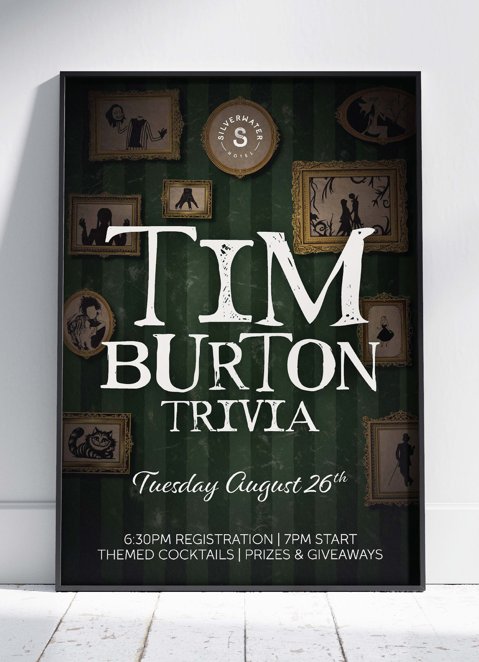
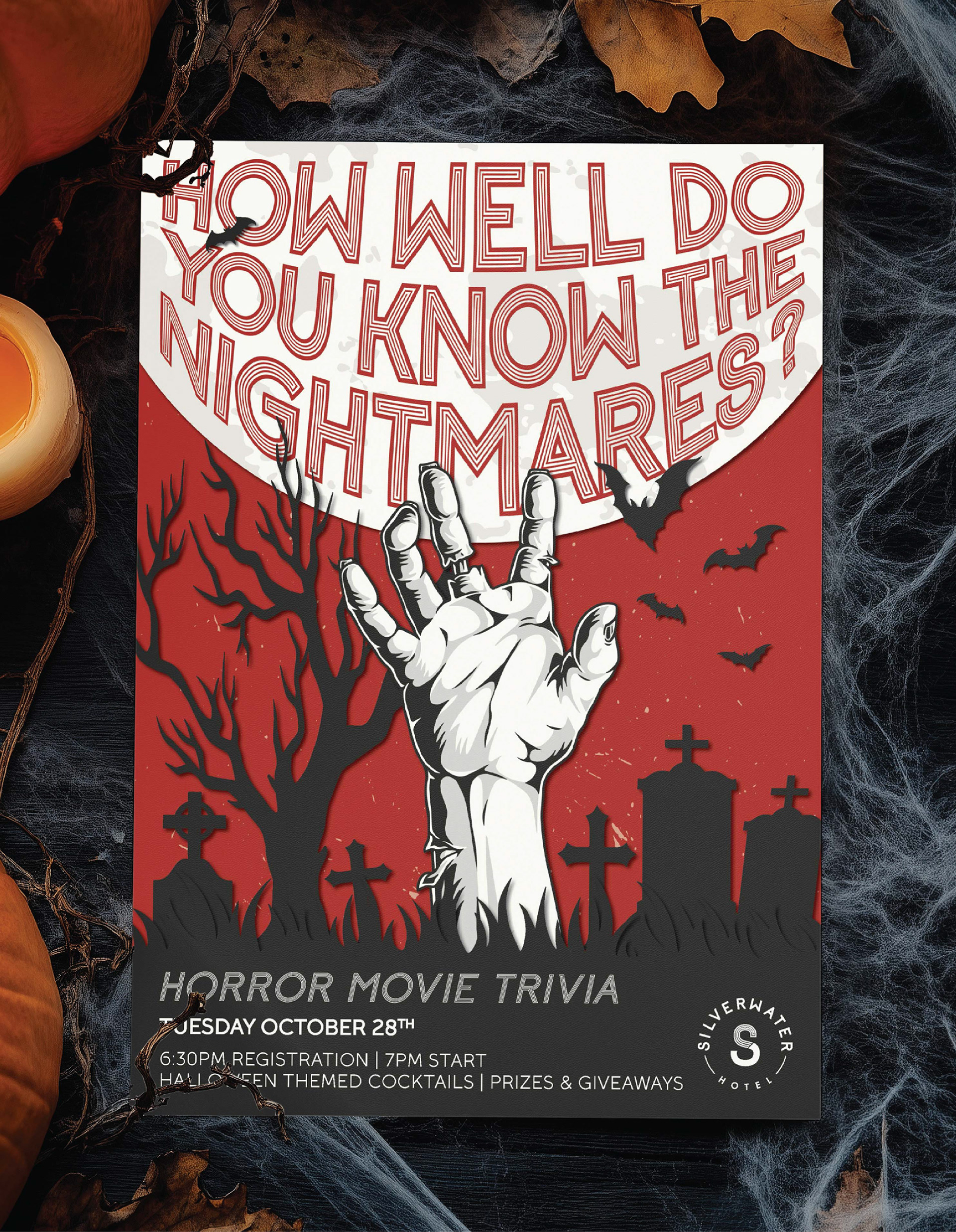
Themed trivia night calls for more than just a poster with the title slapped on it.
For this Tim Burton-themed trivia event, I created artwork inspired by the distinctive visual world of Burton's films. The project involved researching his filmography and identifying recurring visual cues across his work. Colour palettes and typography to characters, imagery and the overall dark, quirky atmosphere.
The challenge was creating something that felt immediately recognisable and on-theme, while developing an original piece of artwork rather than relying on just existing movie imagery.
From Buying Day To Better Buying Decisions.
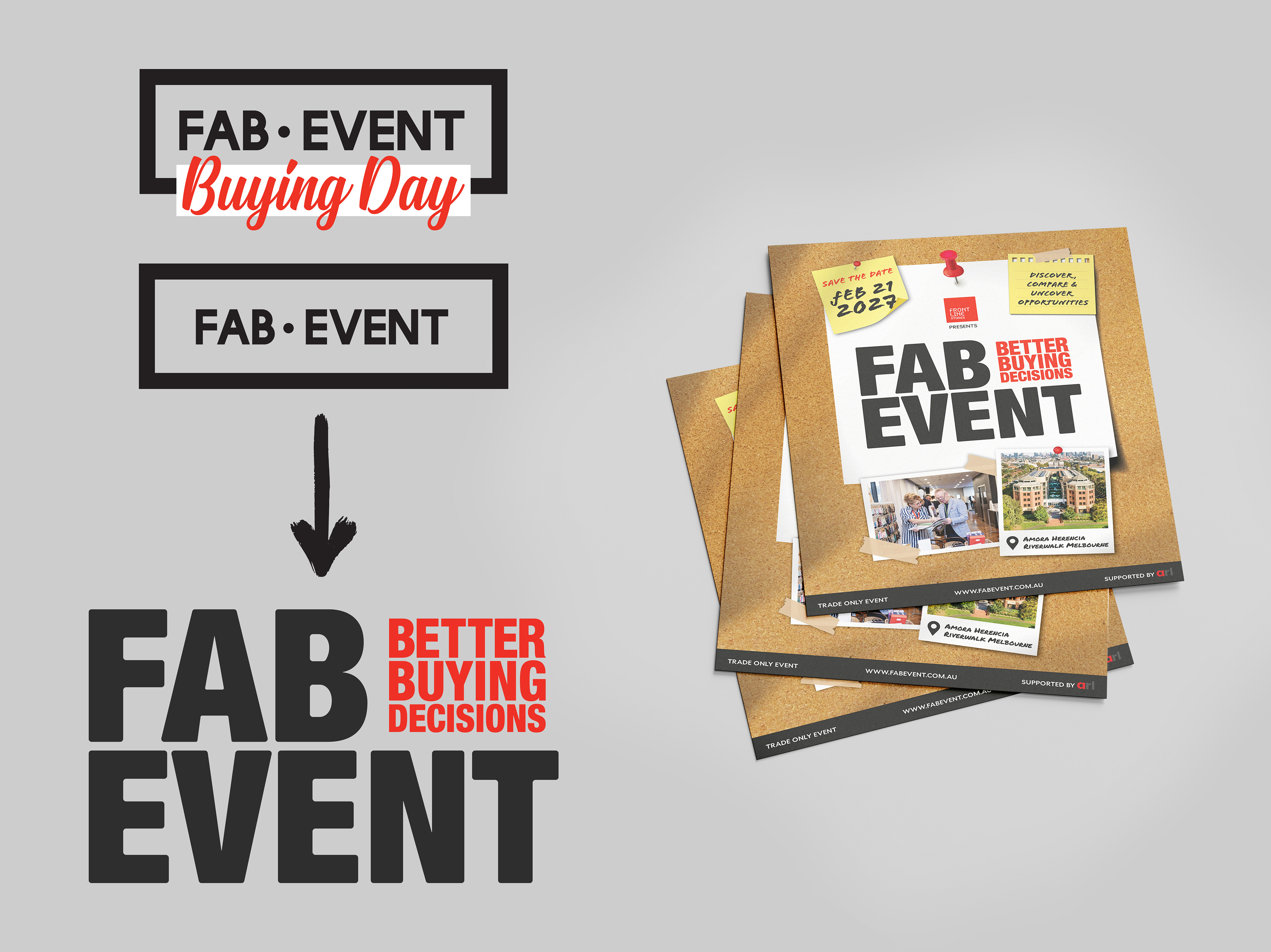
Sometimes the problem isn't the event. It's how you're selling it. FAB Event was previously positioned as a “Buying Day”, but the messaging wasn't really giving people a reason to get excited about attending.
The brief was to reposition it as somewhere buyers could discover new products, save money and ultimately make better buying decisions.
I gave the logo a refresh by removing the old bounding box, scaling up the FAB EVENT lettering and introducing the new “Better Buying Decisions” tagline as a key part of the identity. The existing red was kept as a way to separate the event name from the new messaging.
The result was a cleaner, bolder identity with a much clearer message. Less “come to our buying day”, more “come here and make better buying decisions.”
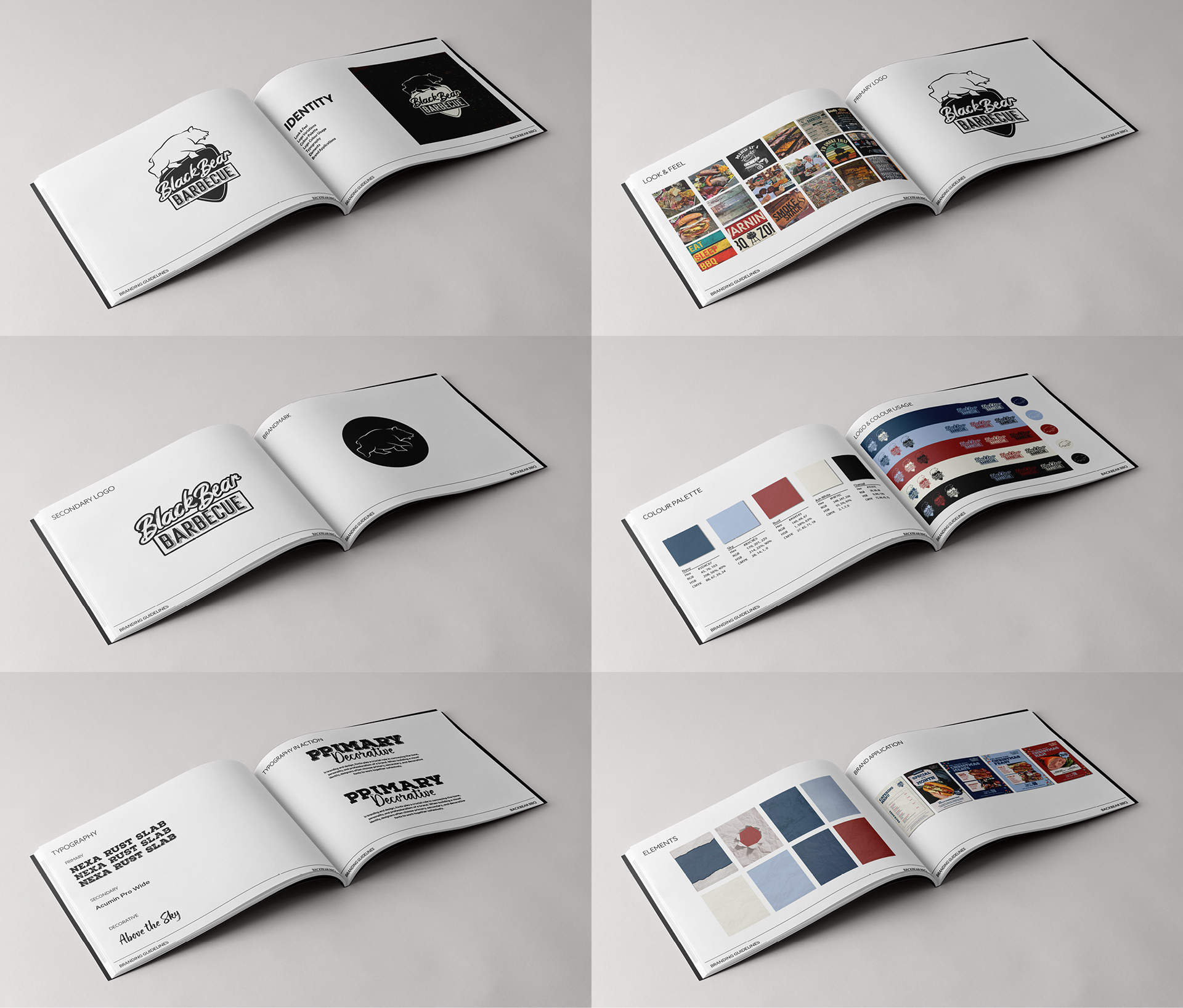
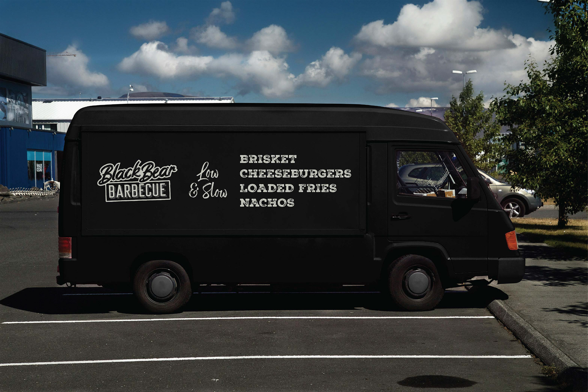
BlackBear BBQ Had The Foundations. They Just Needed A Bit Of A Tidy-up.
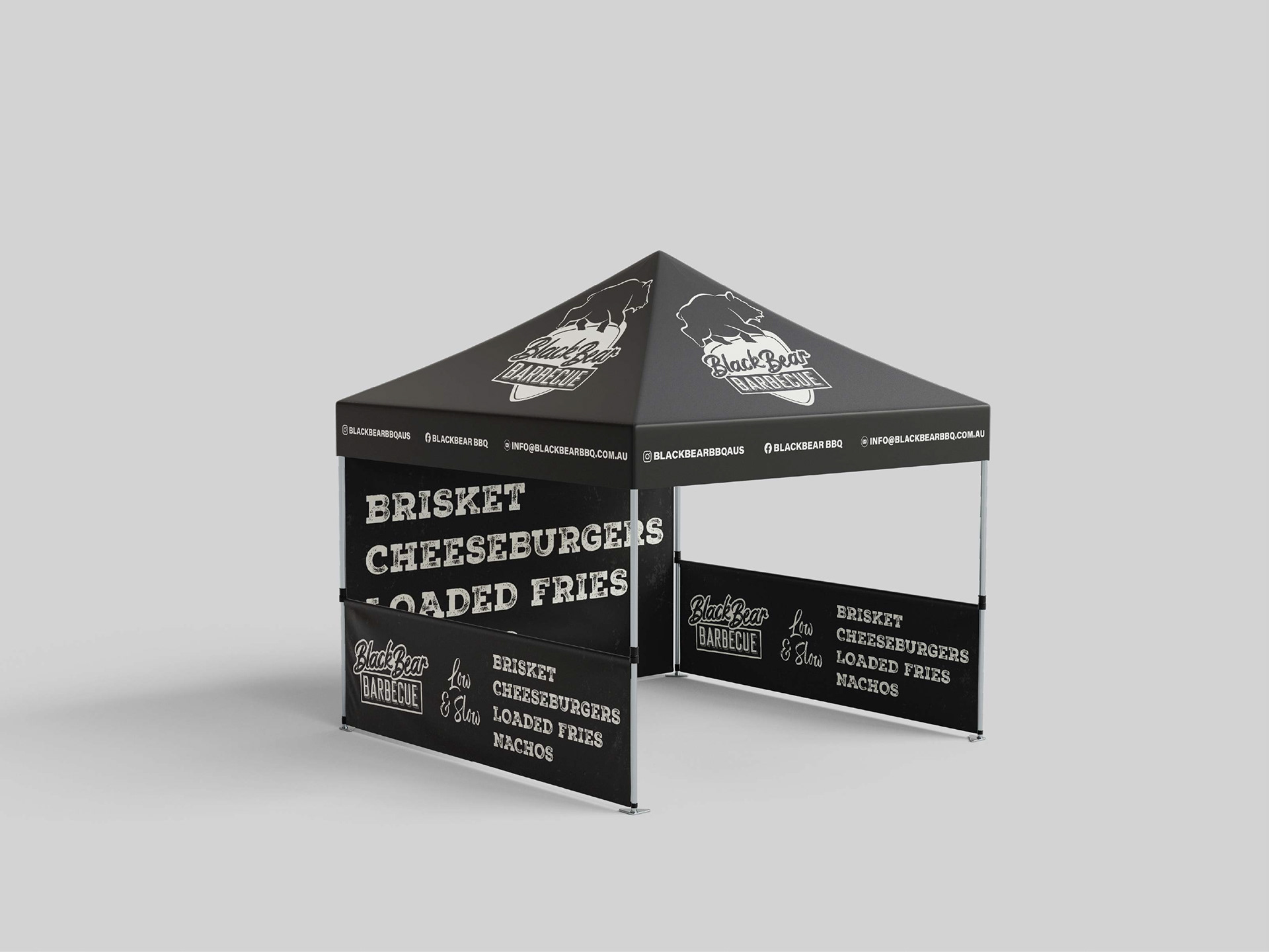
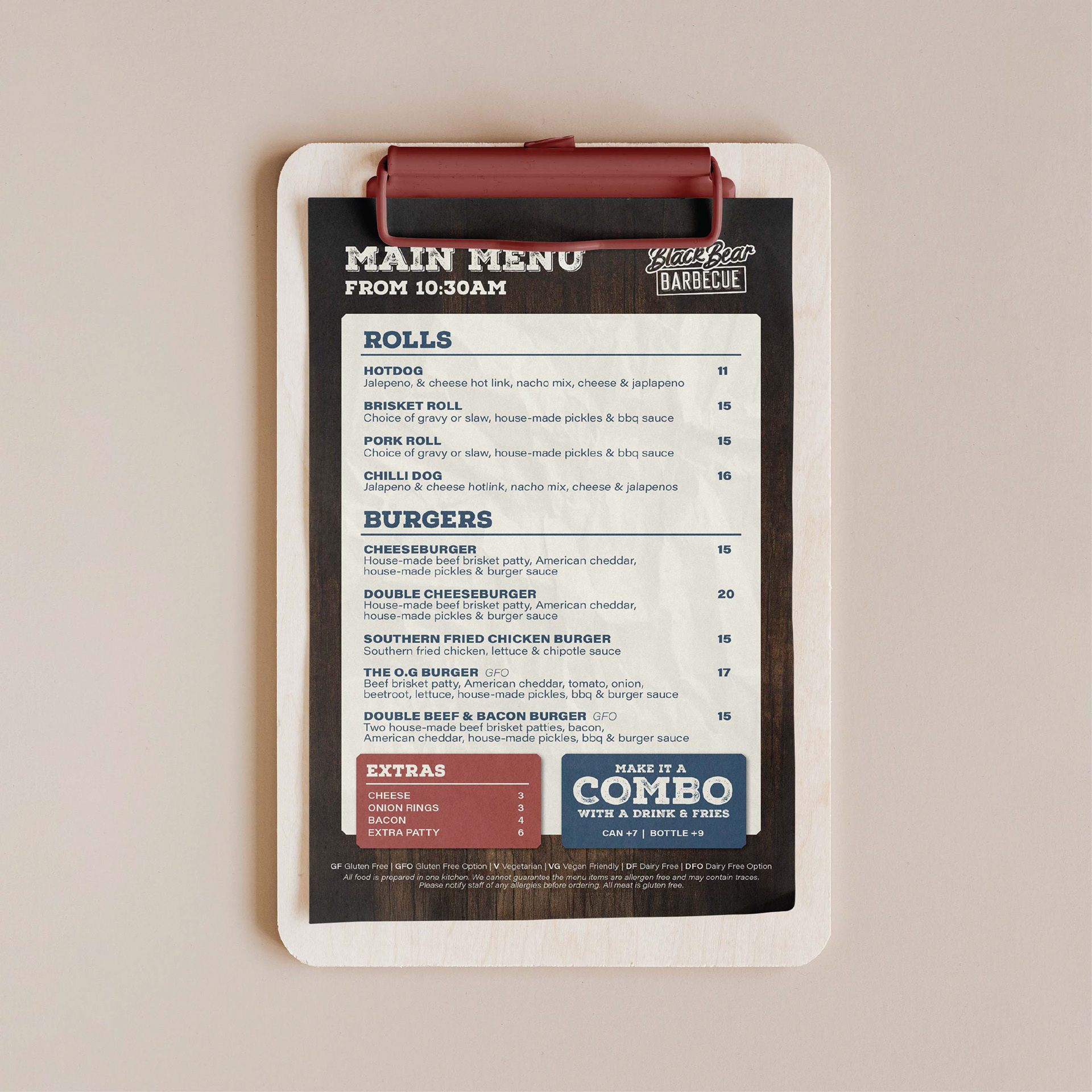
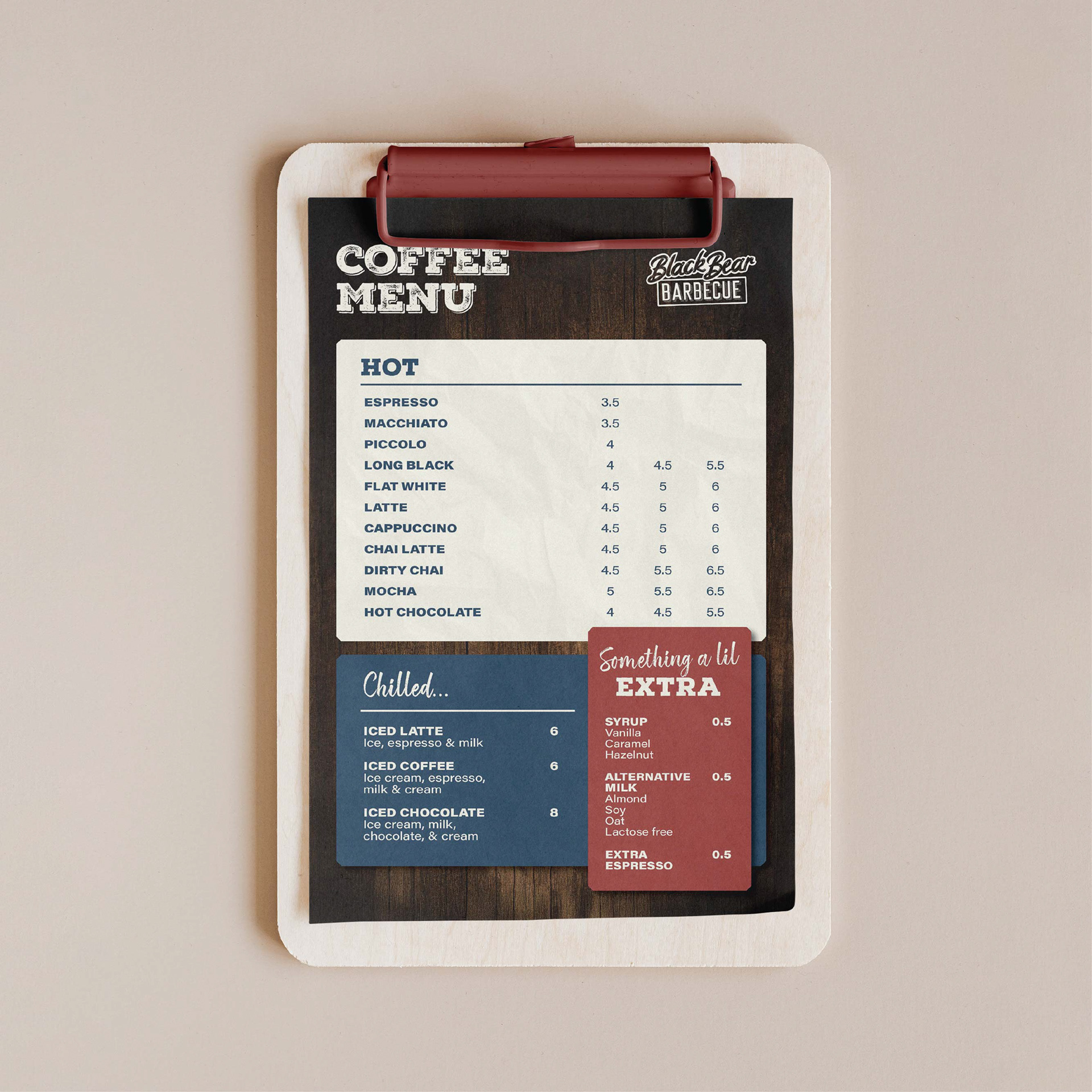
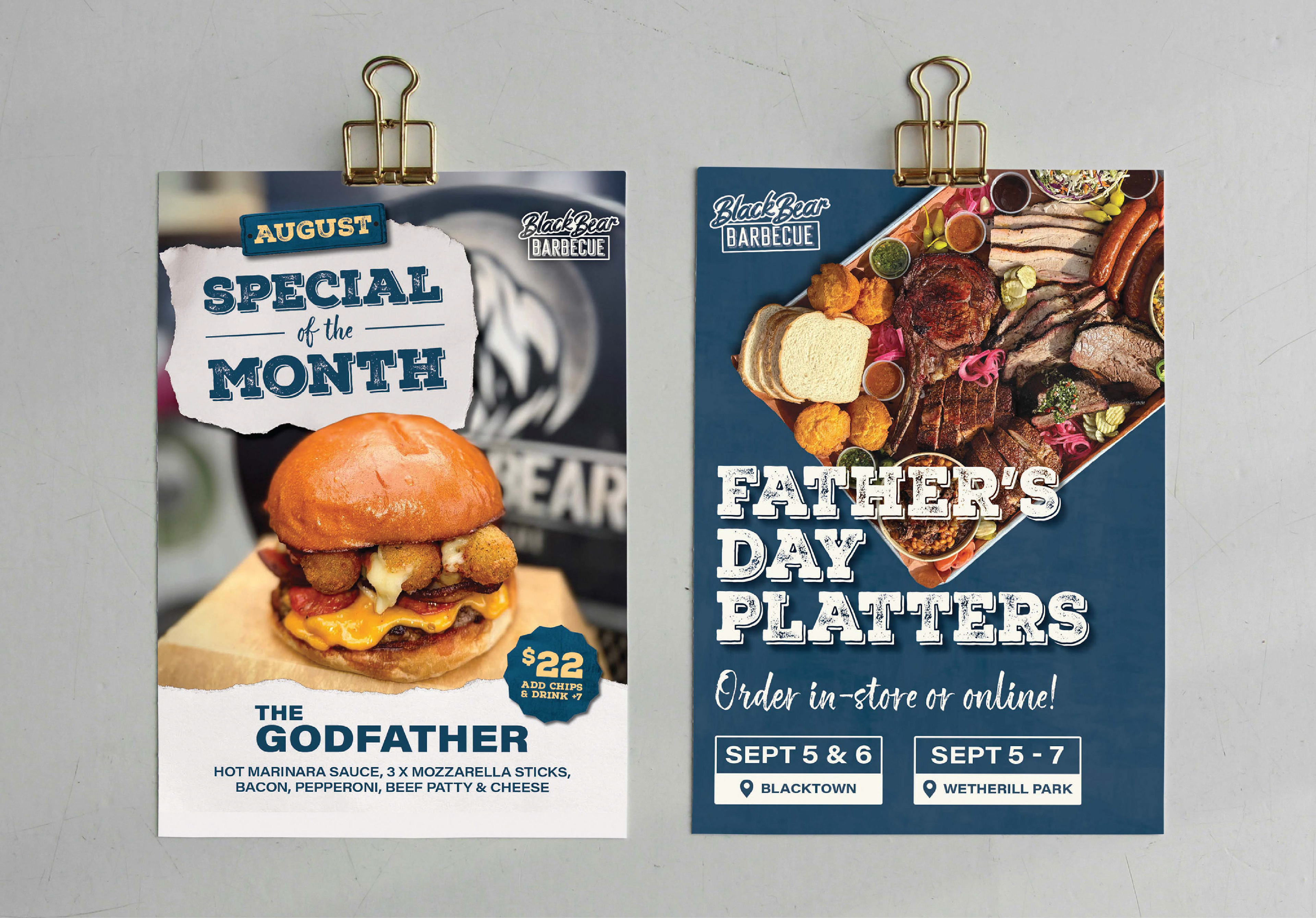
BlackBear BBQ had an established identity, but needed a clearer and more consistent visual system that could work across everything from packaging and menus to social media.
I refined and simplified the existing logo, tightened up the colour palette and introduced a clear typographic hierarchy to make the brand easier to apply consistently.
The result was pulled together into a straightforward brand guidelines book designed to be genuinely useful rather than something that gets filed away and forgotten.
A Lot Of Content.
One Magazine.
One Magazine.
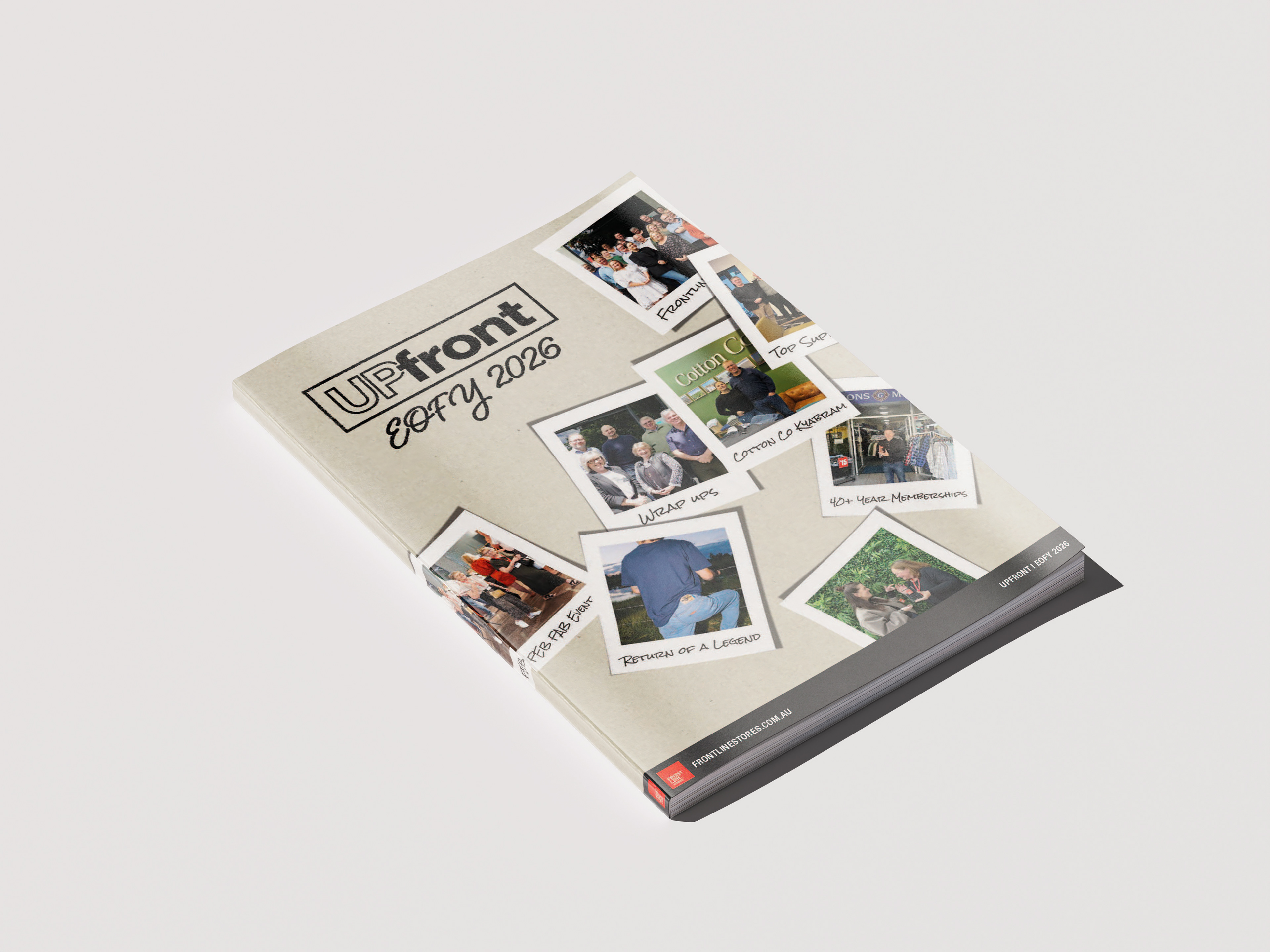
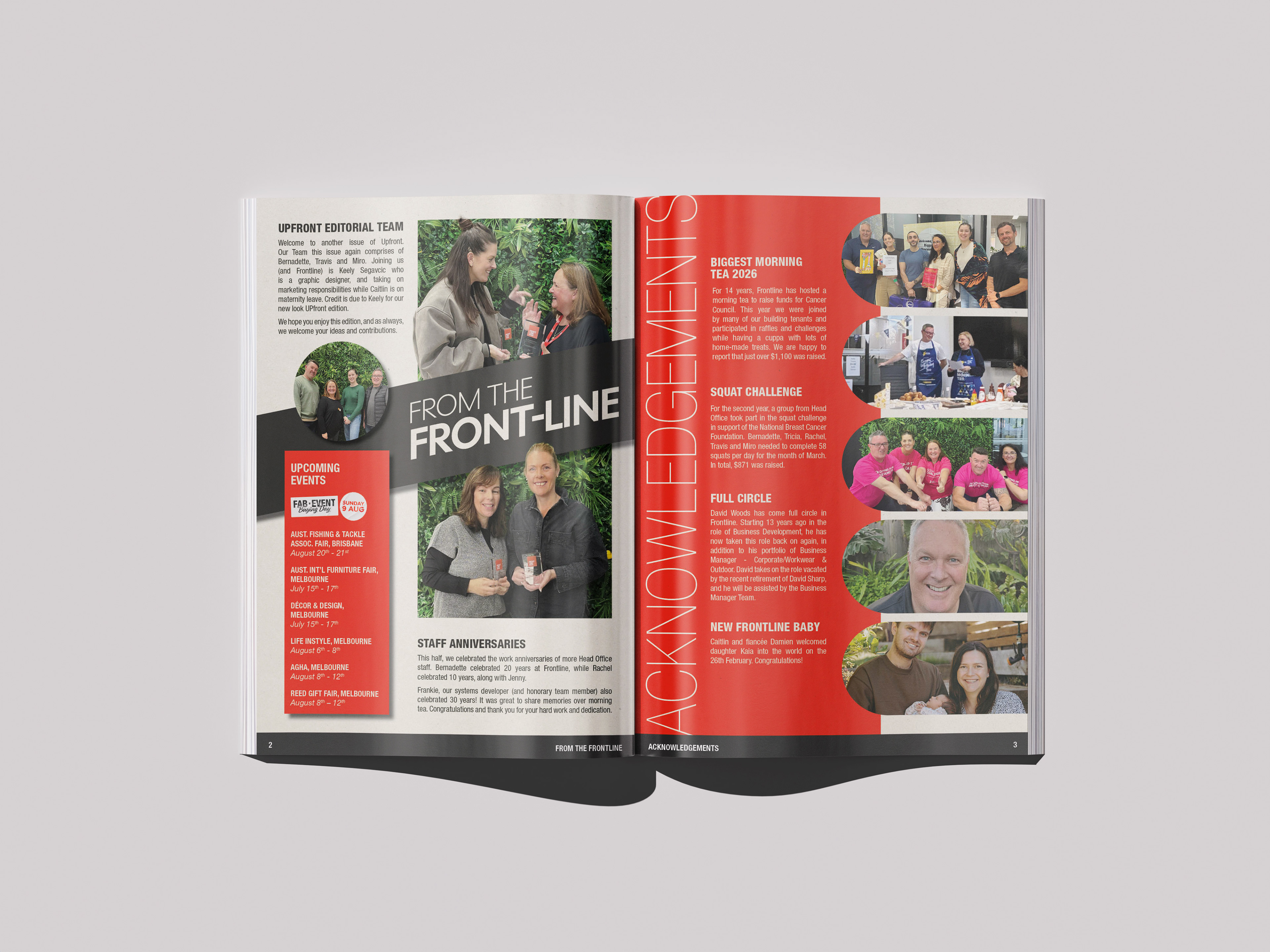
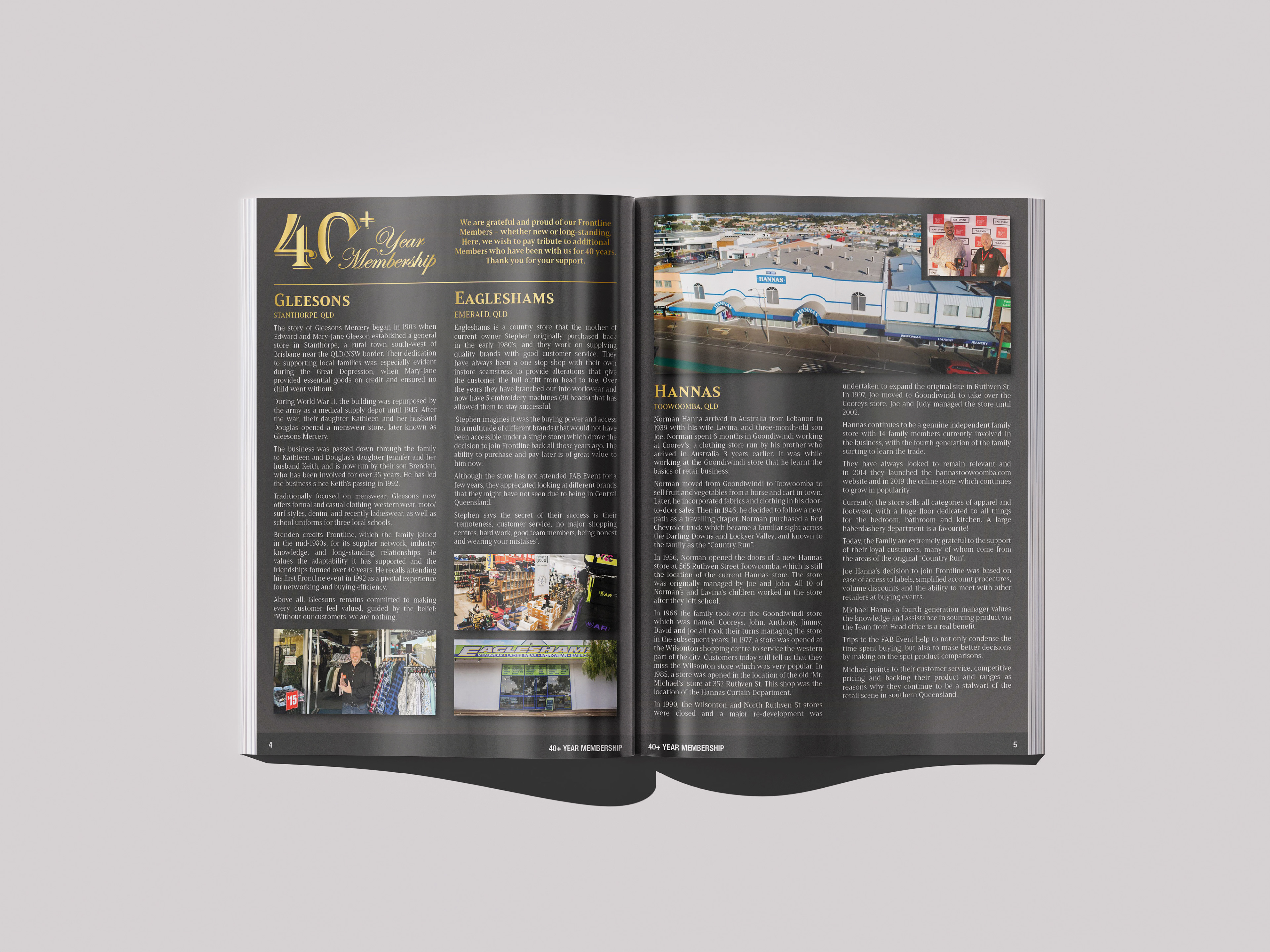
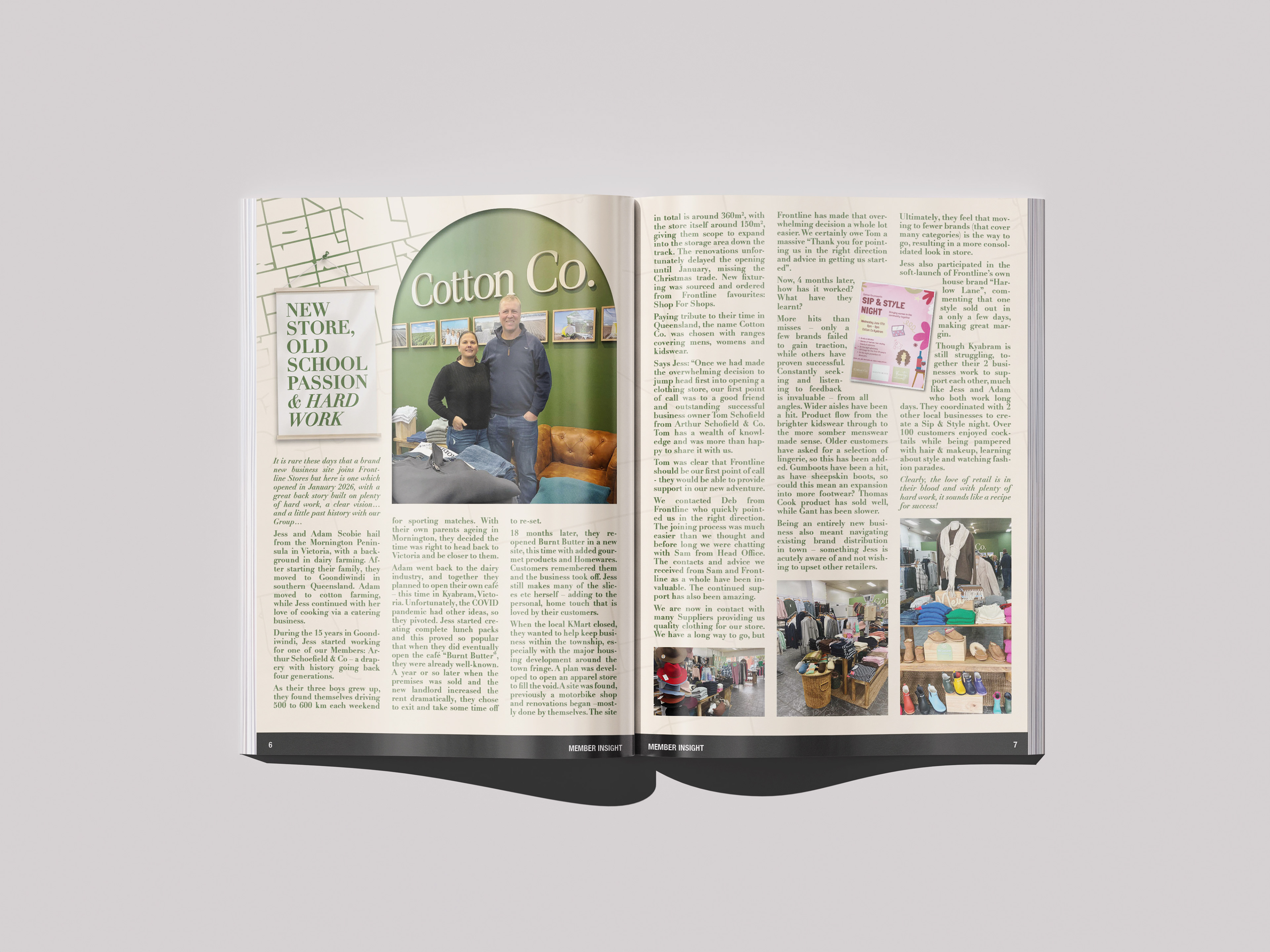
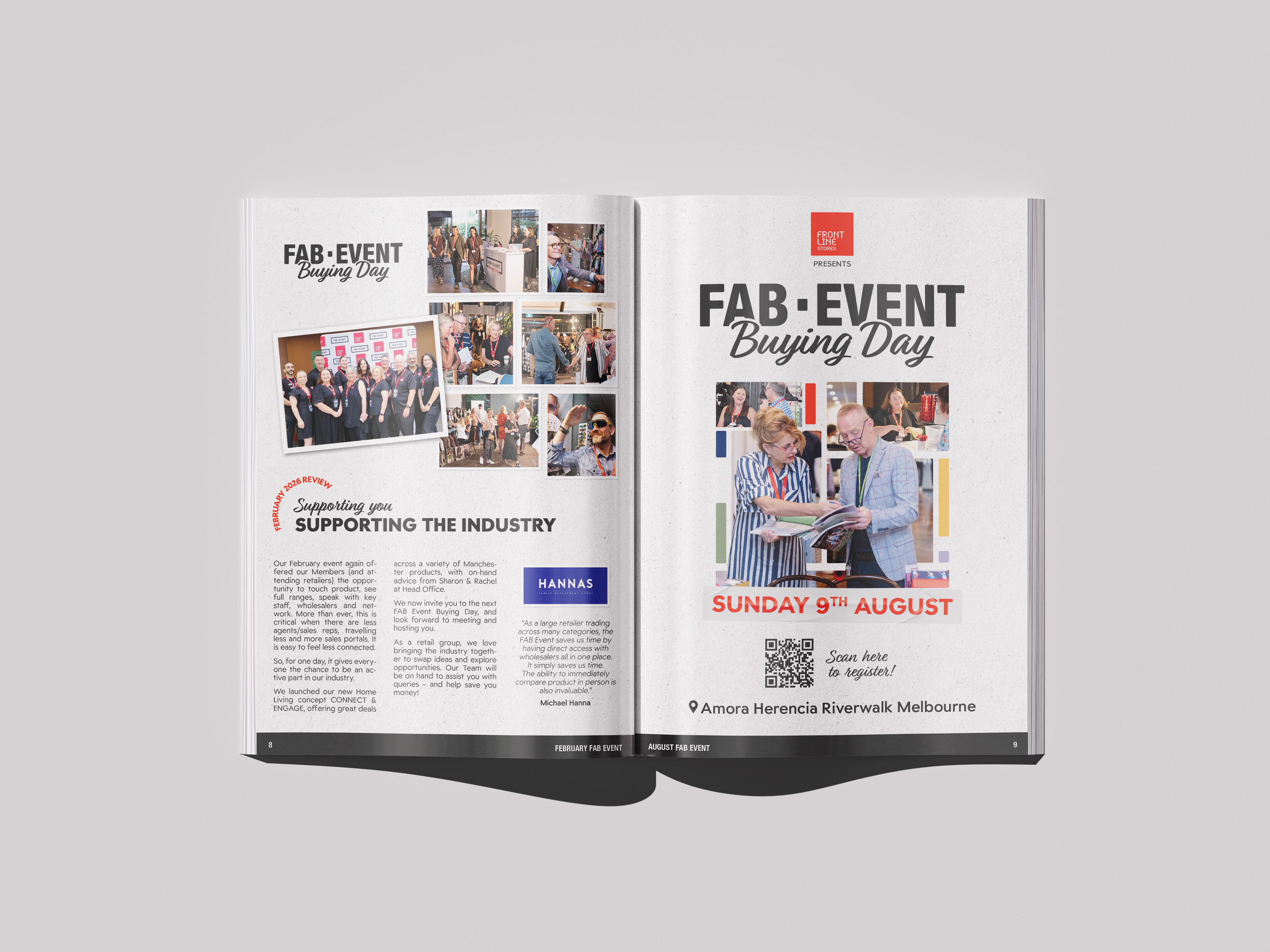
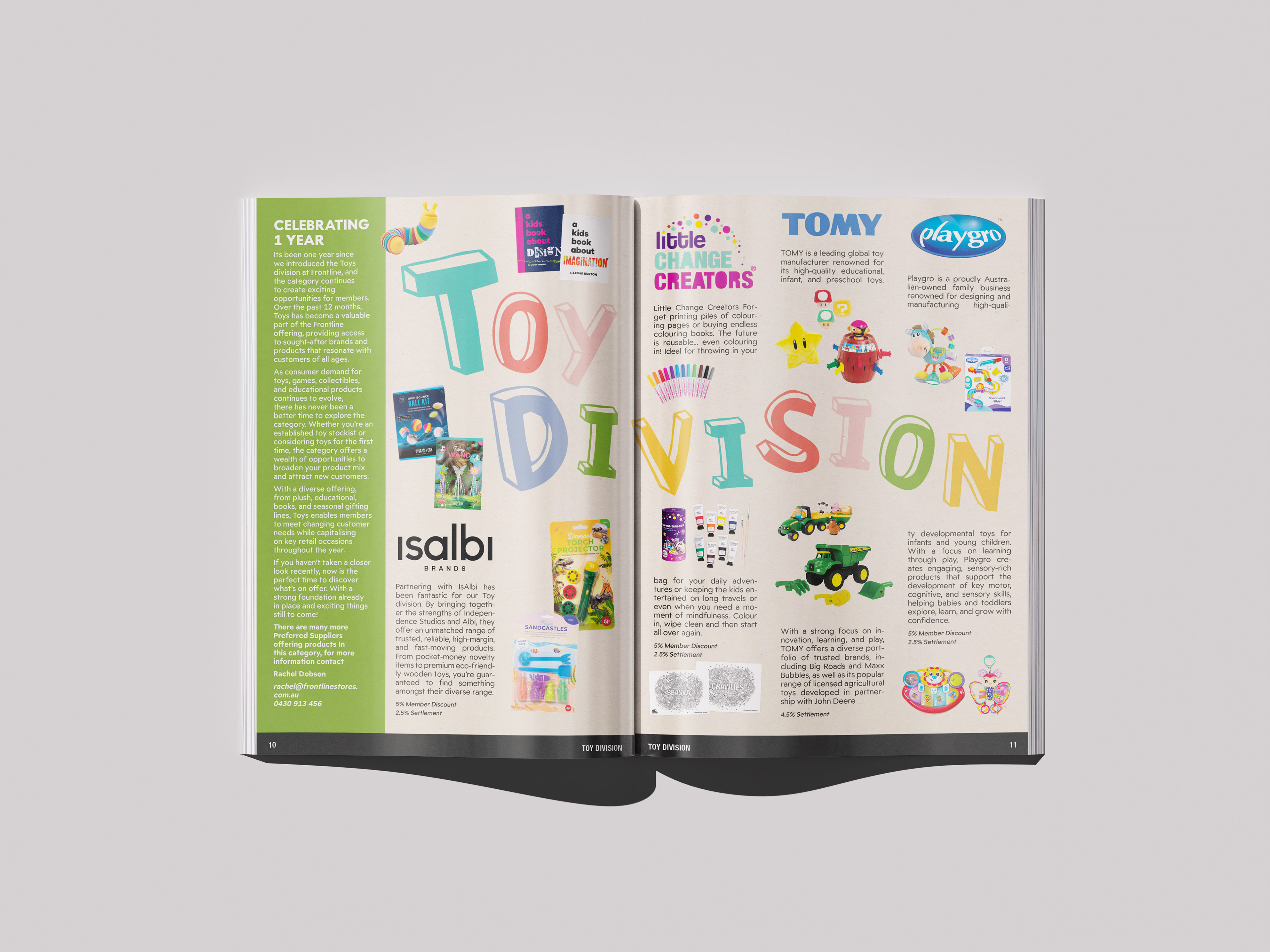
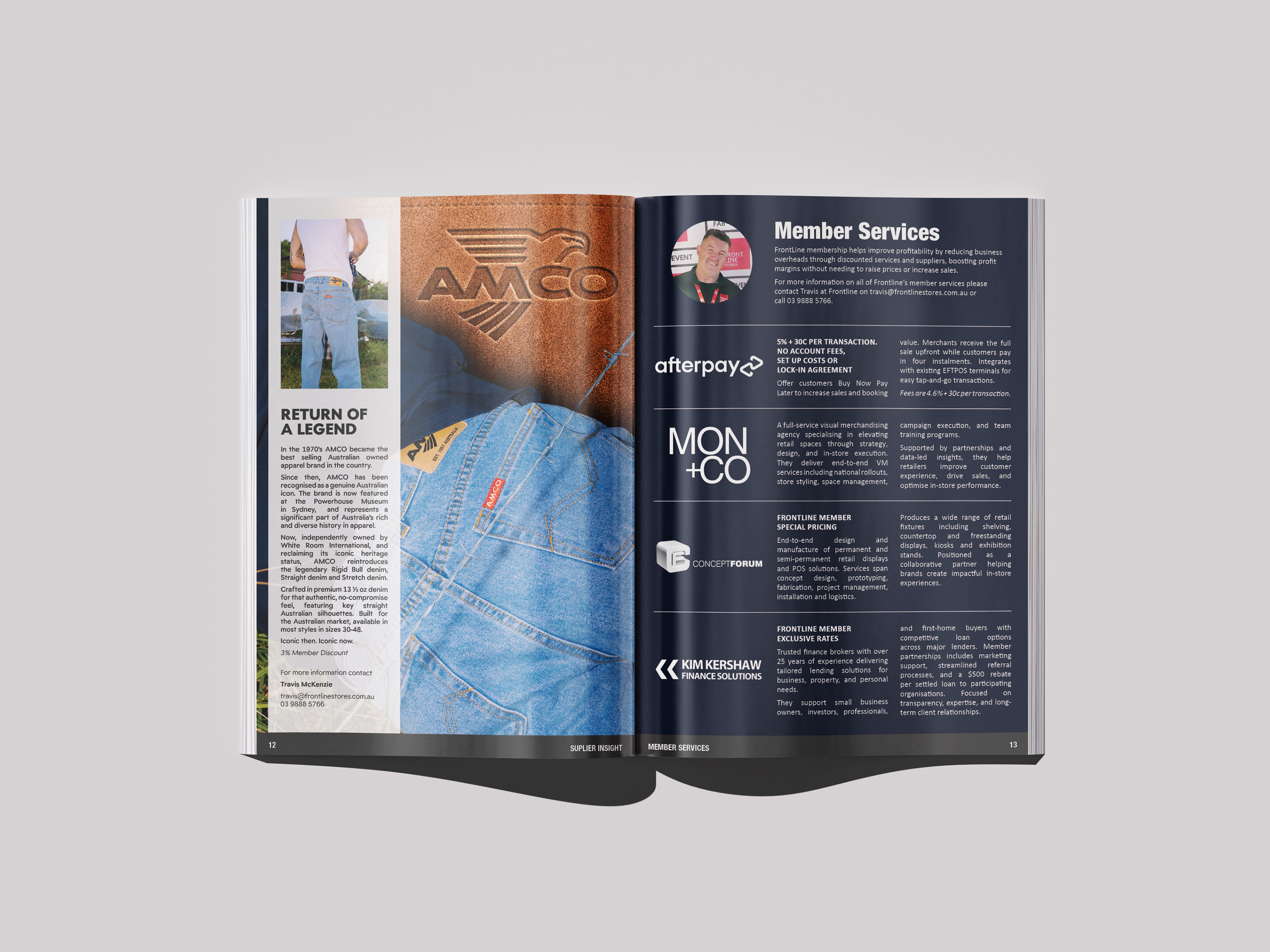
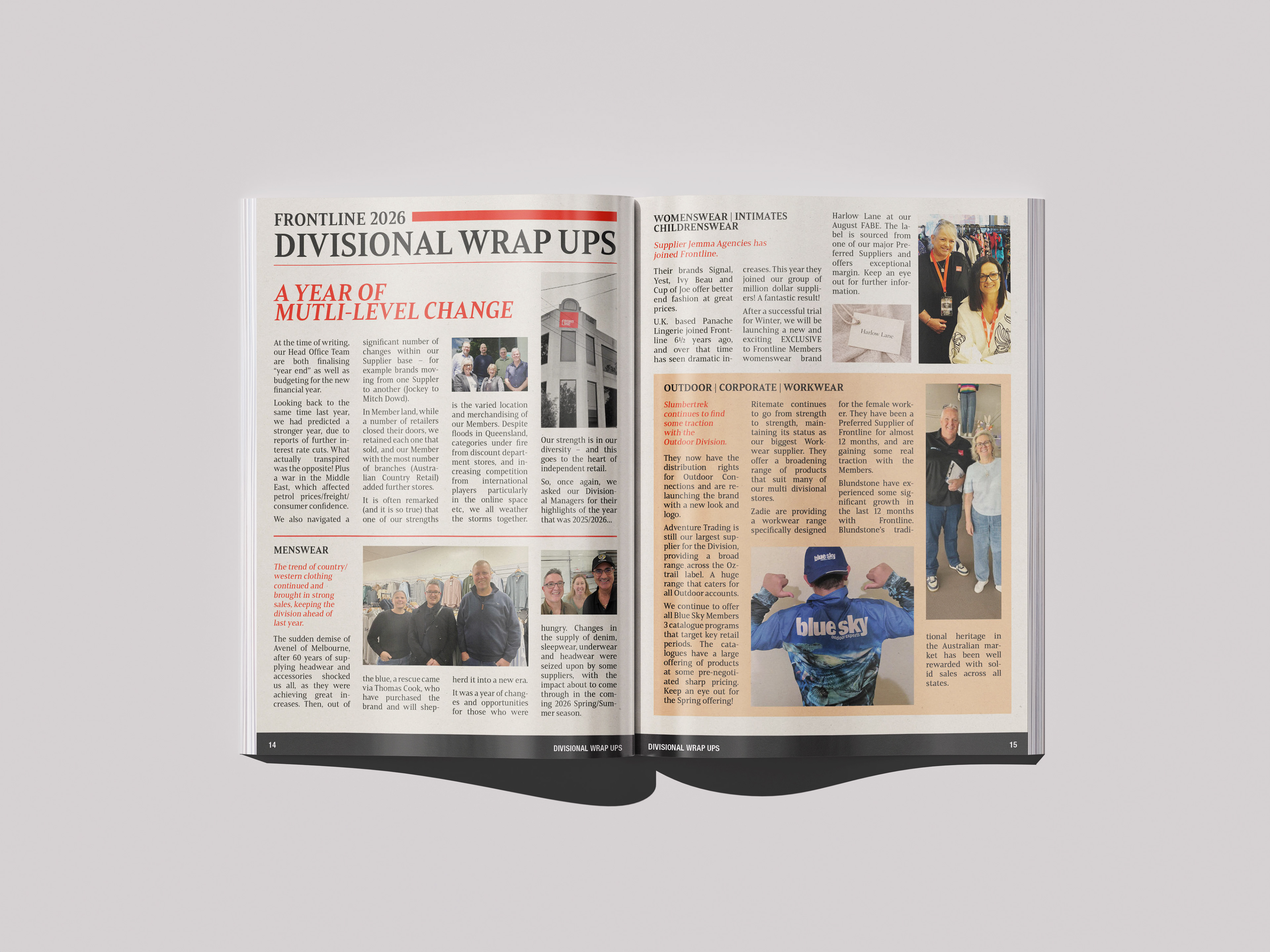
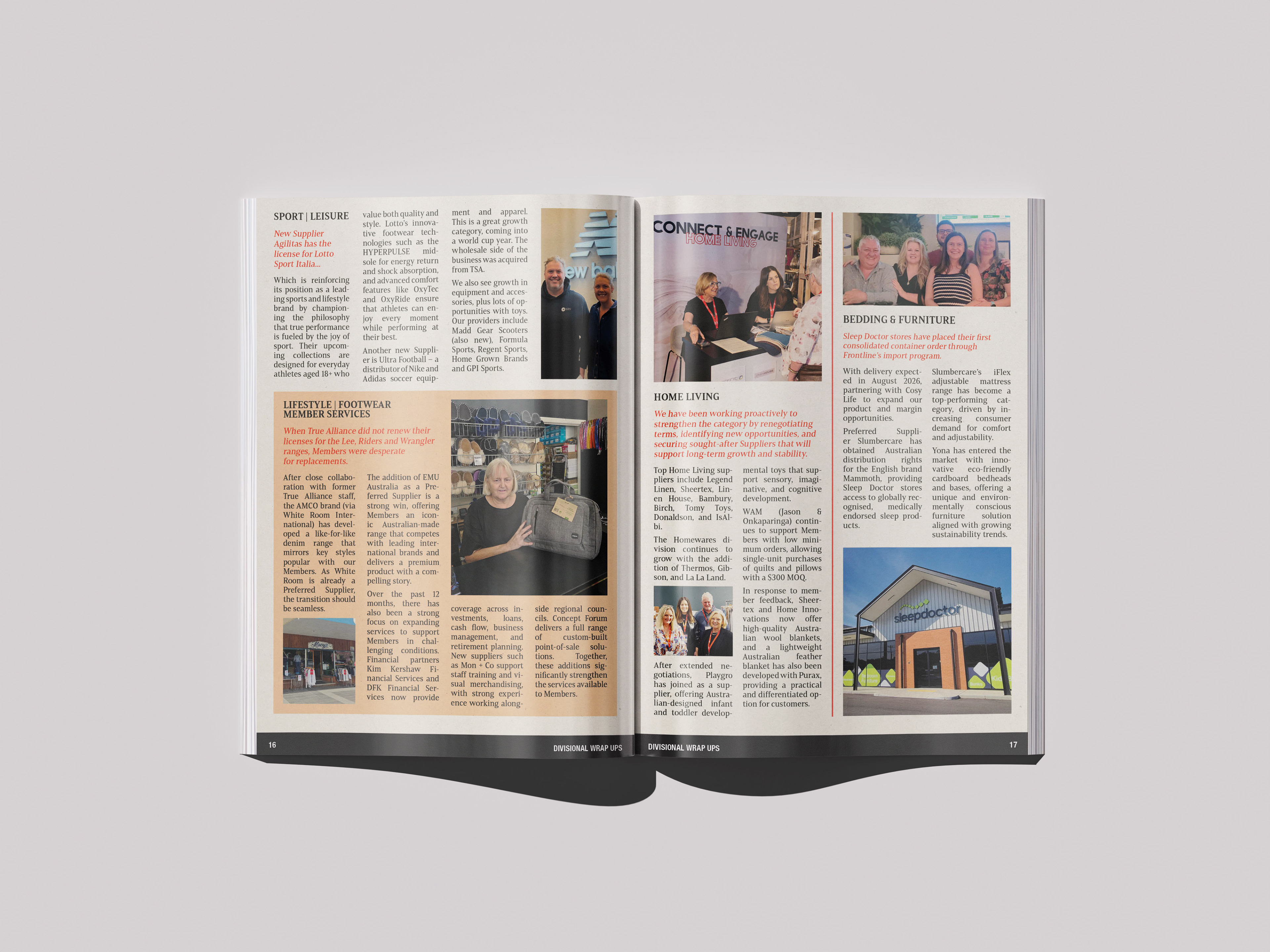
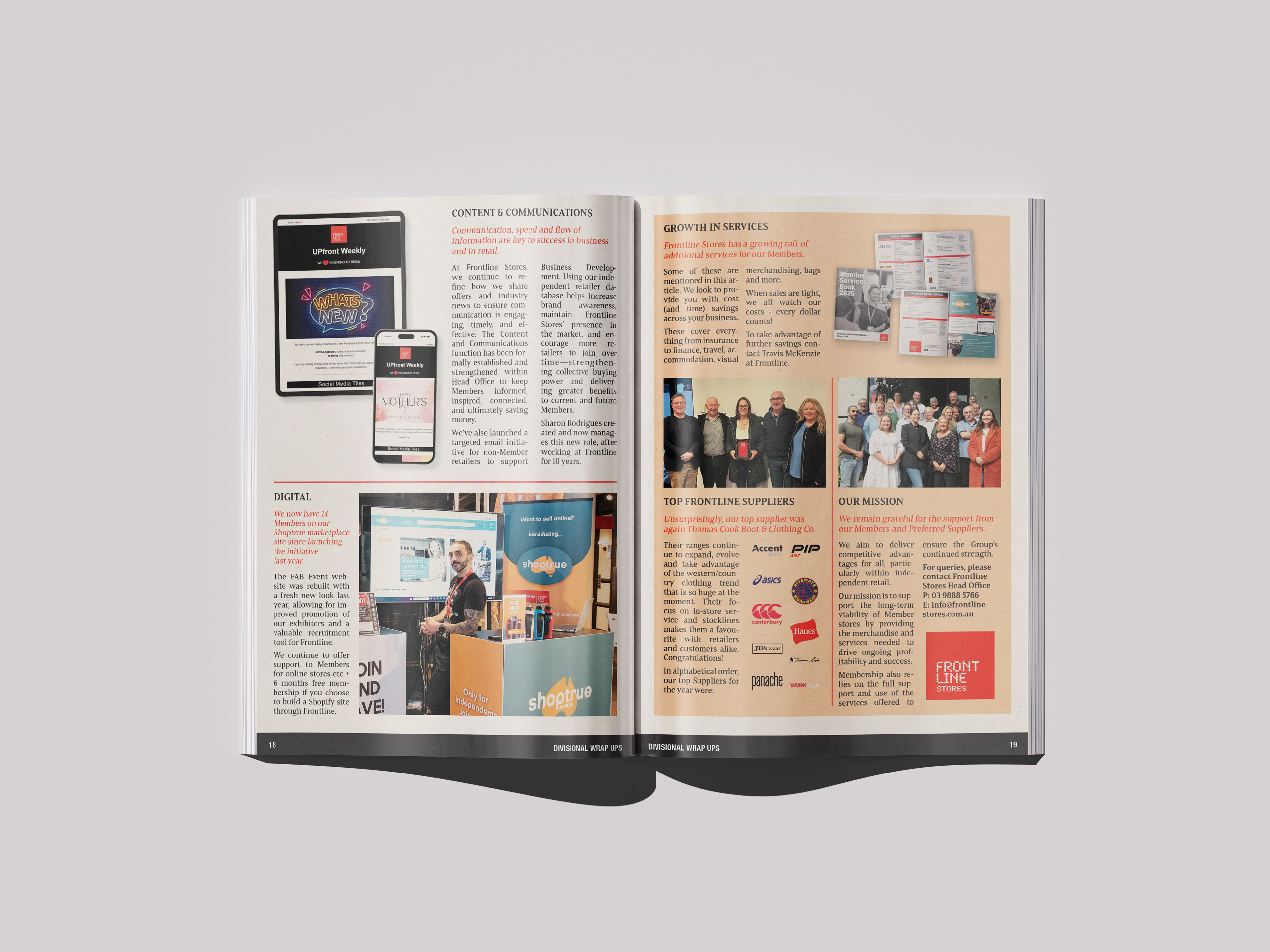
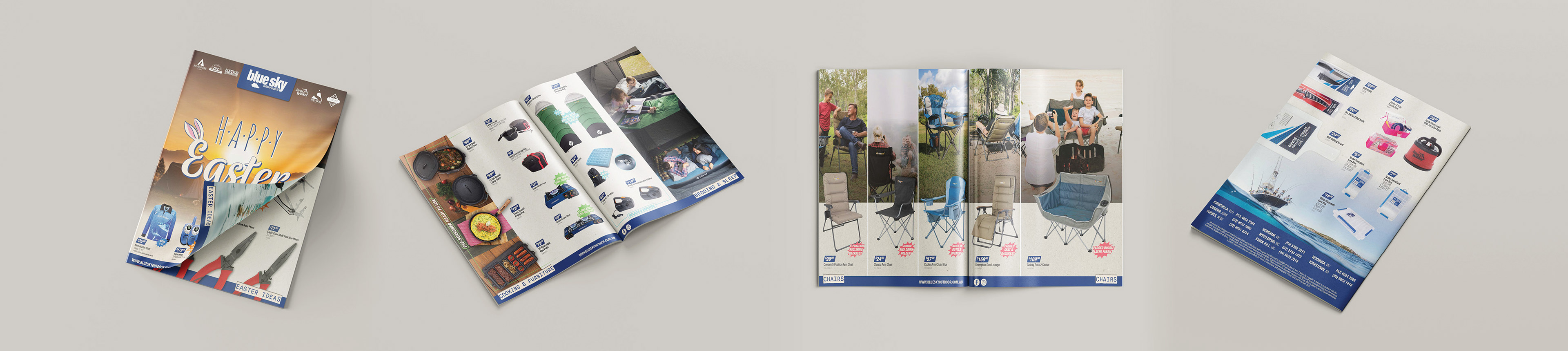
UPfront is a member magazine for Frontline Stores, packed with company updates, member stories, industry news, events, promotions and plenty of other things happening across the network.
With such a broad mix of content to work with, the challenge was keeping the magazine interesting without letting it become visually chaotic. I created a flexible editorial system that allowed each story to have its own look while still feeling like part of the same publication.
Lots Of Packages, Lots Of Information, One Booklet To Make Sense Of It All.
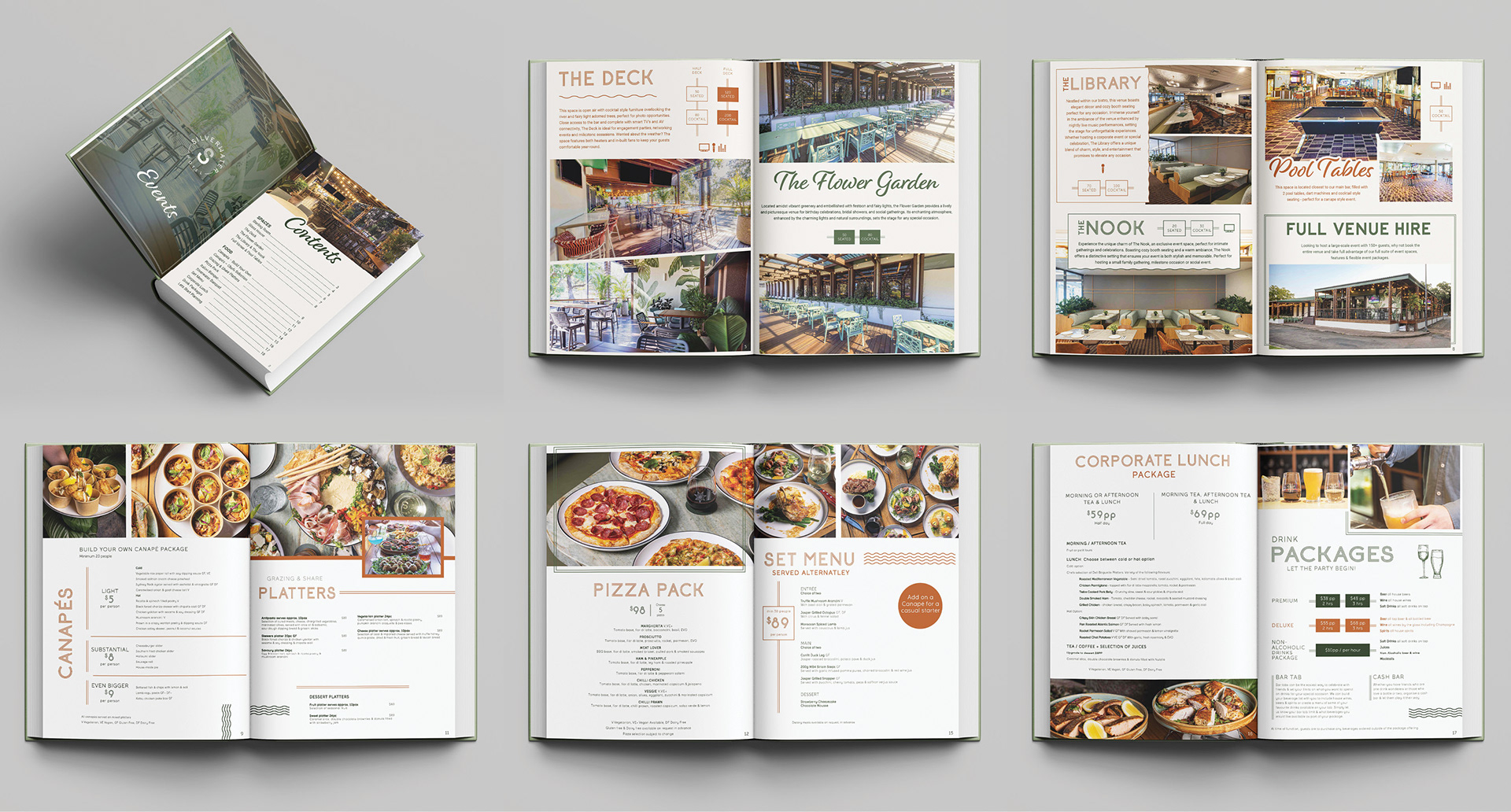
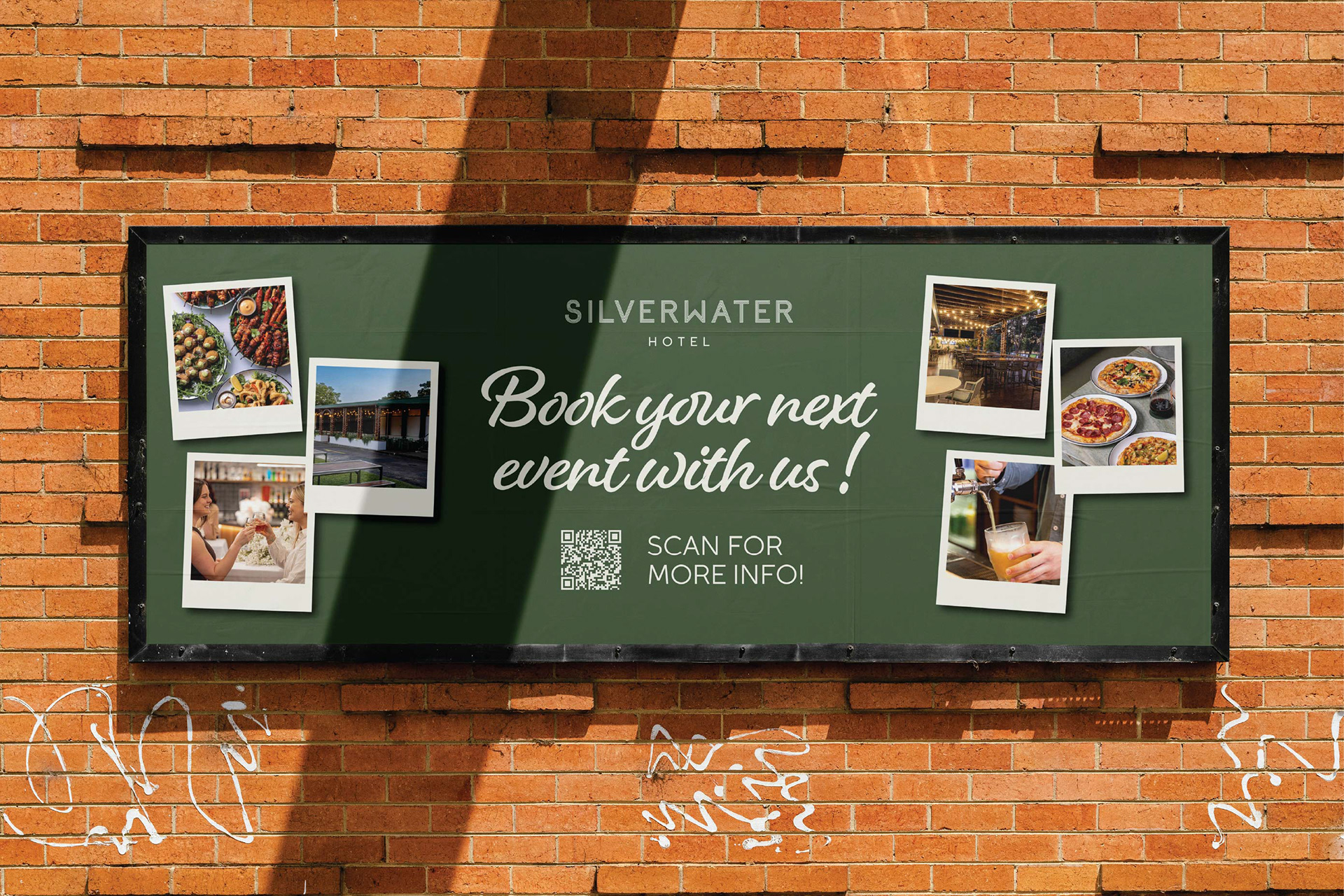
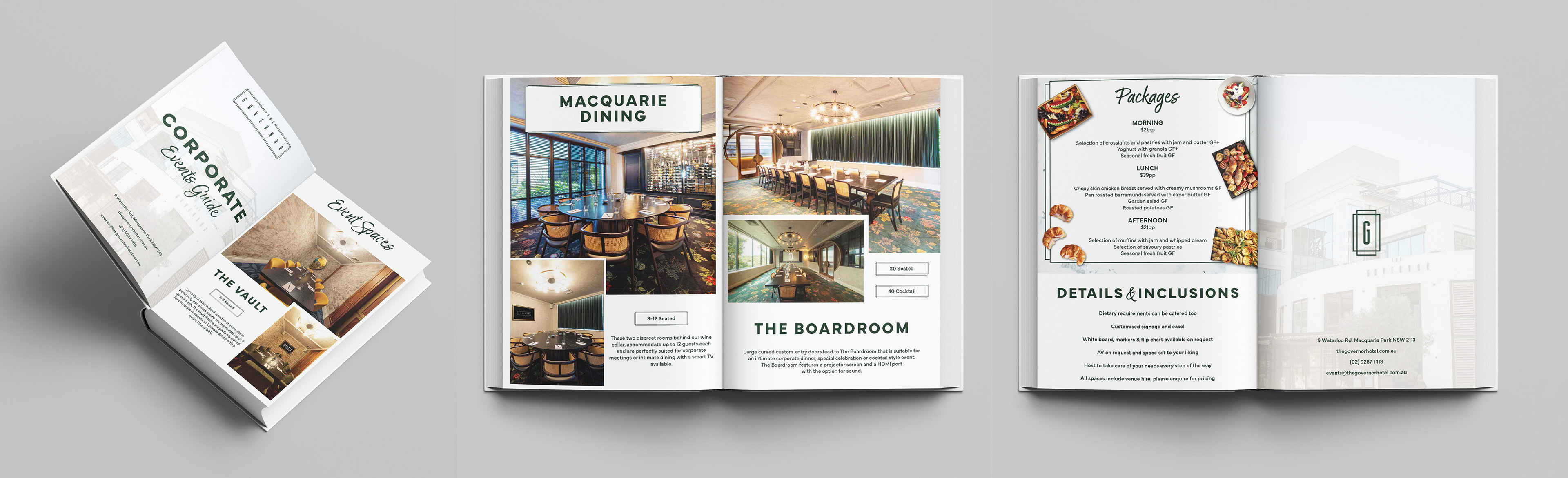
Silverwater Hotel's events team needed a simple way to showcase their event spaces and packages to prospective customers.
I designed a dedicated event guide that brings together the venue's spaces, packages, inclusions and key information in one easy-to-navigate booklet.
The focus was on making a lot of information feel approachable and easy to digest, while still giving the venue a polished and premium presentation. The finished guide gives the events team something practical to take into meetings and send directly to potential clients.
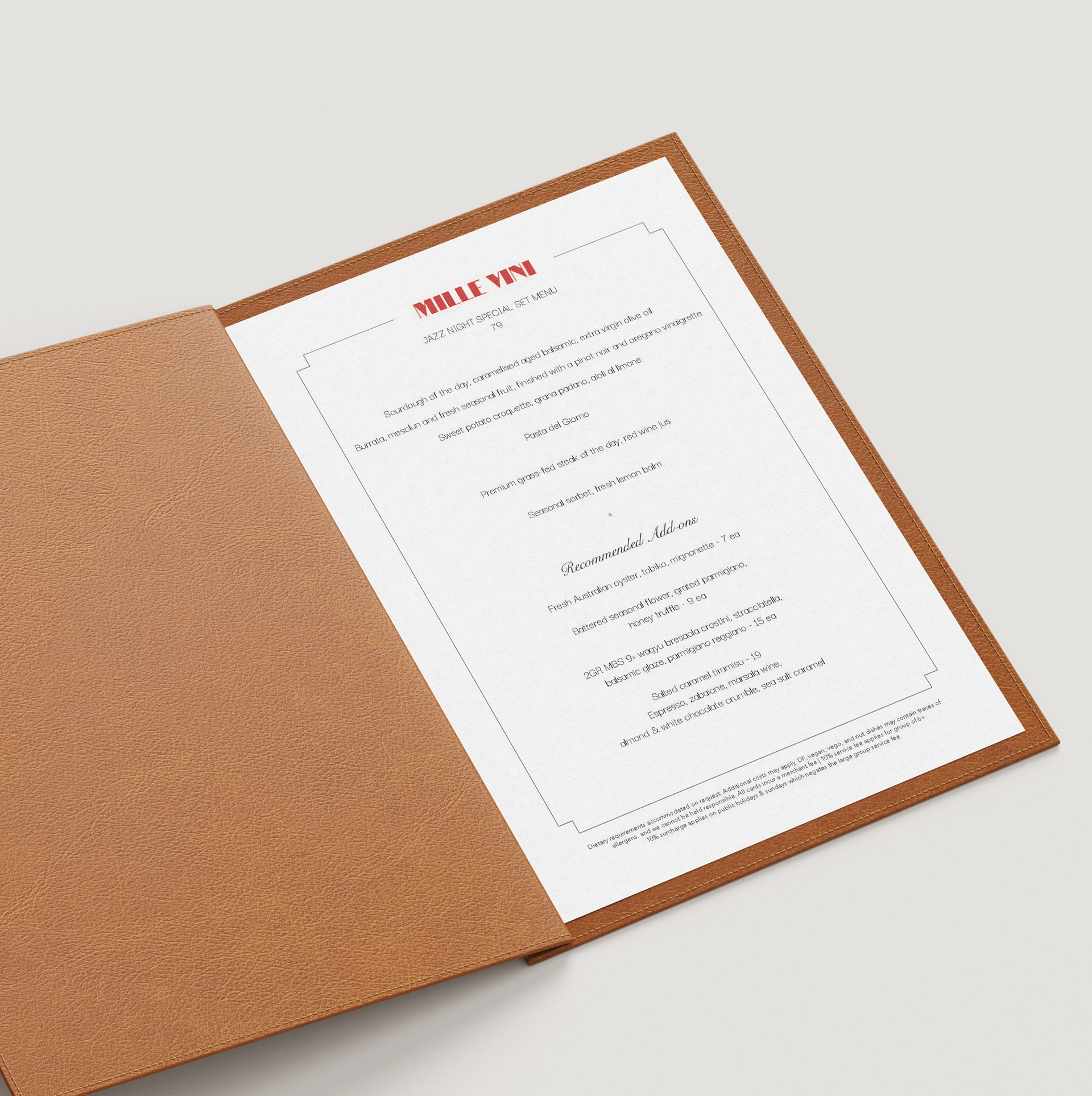
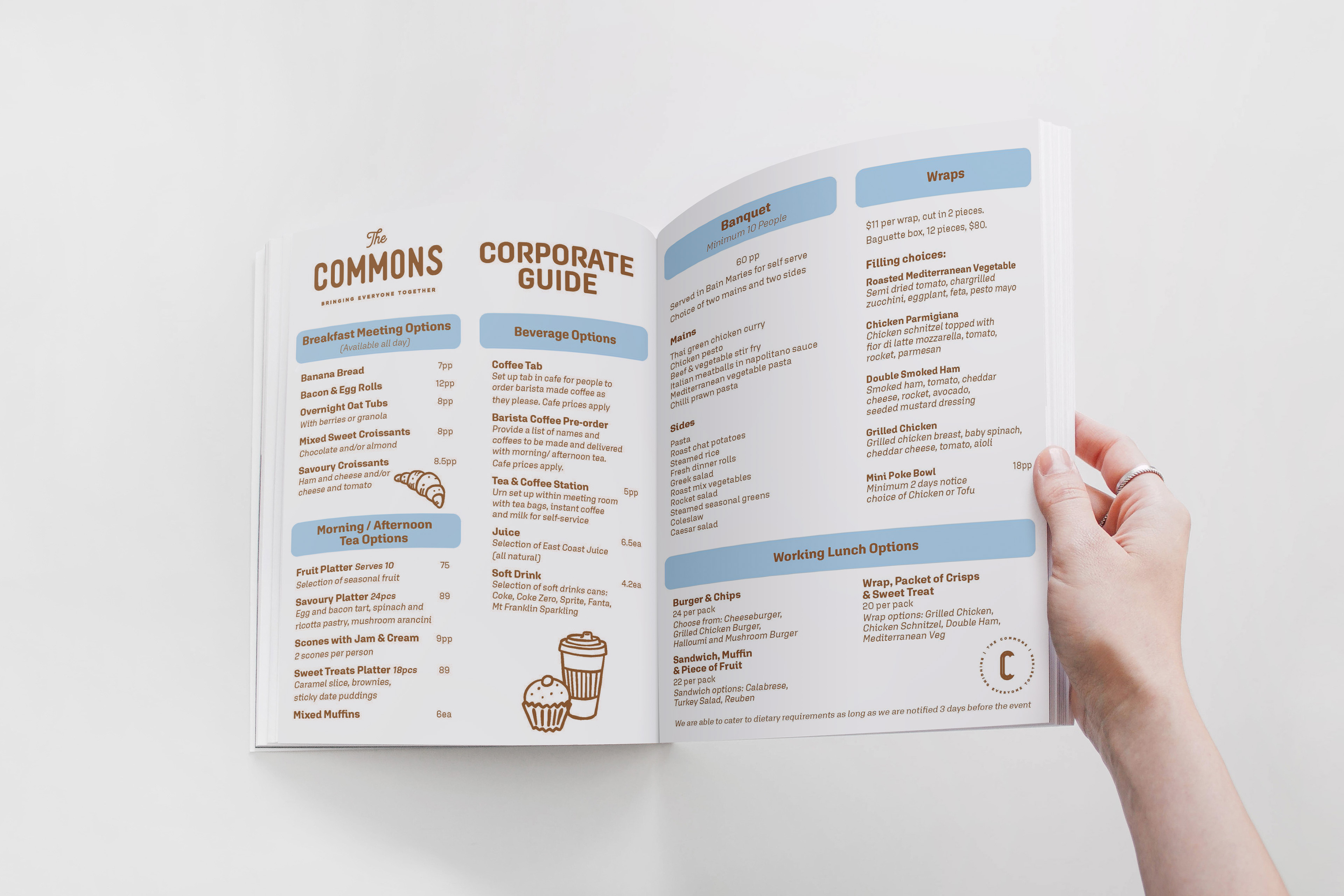
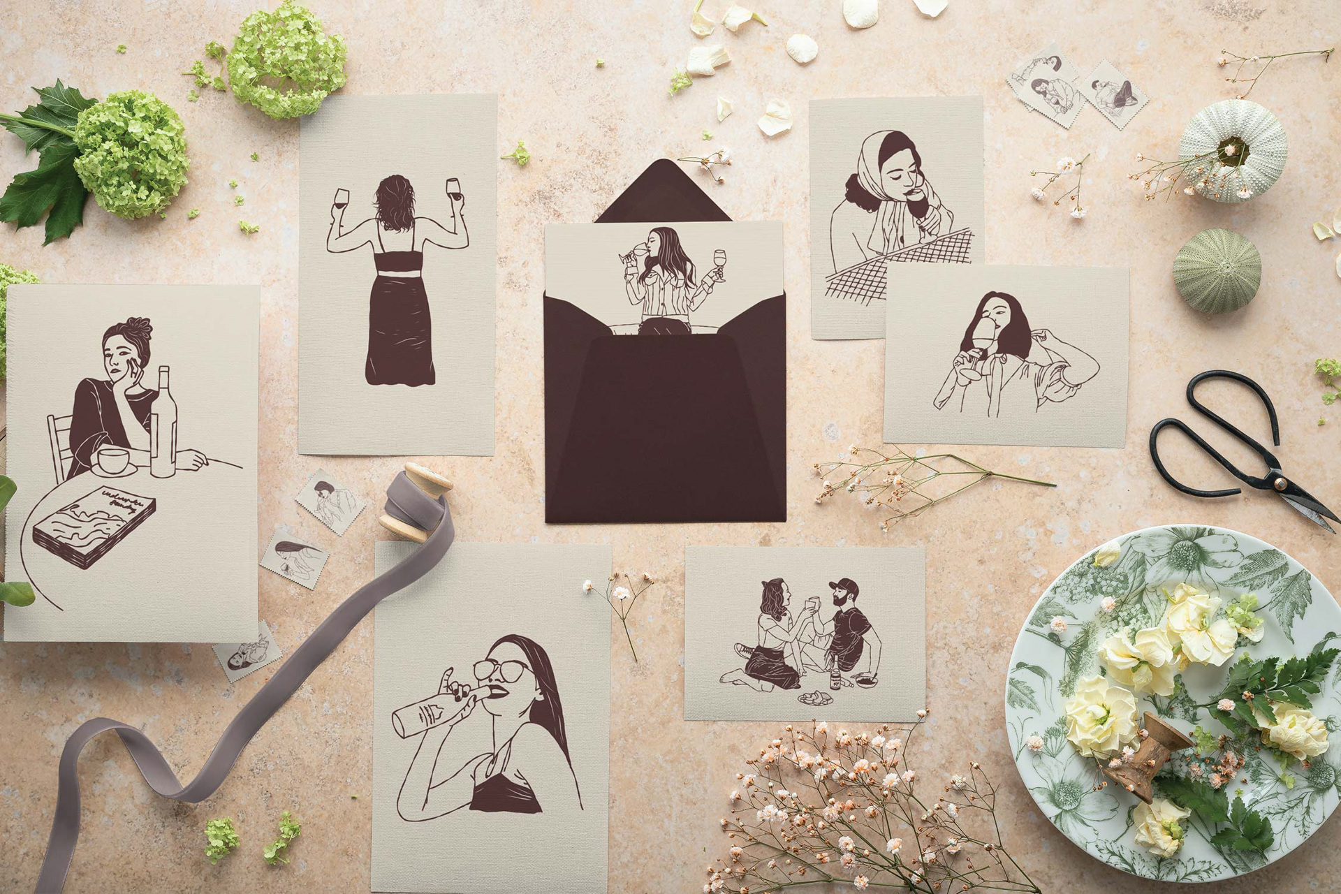
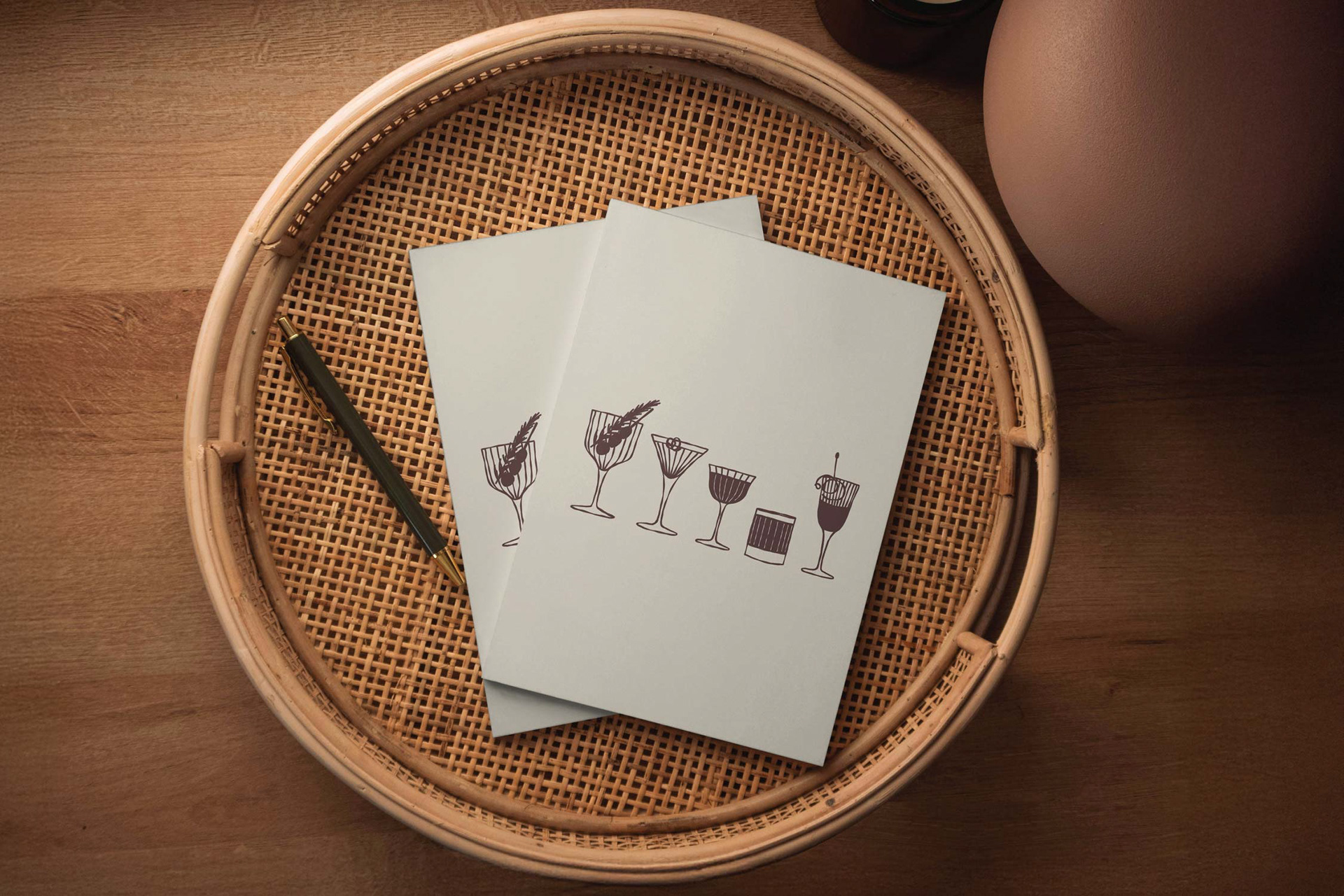
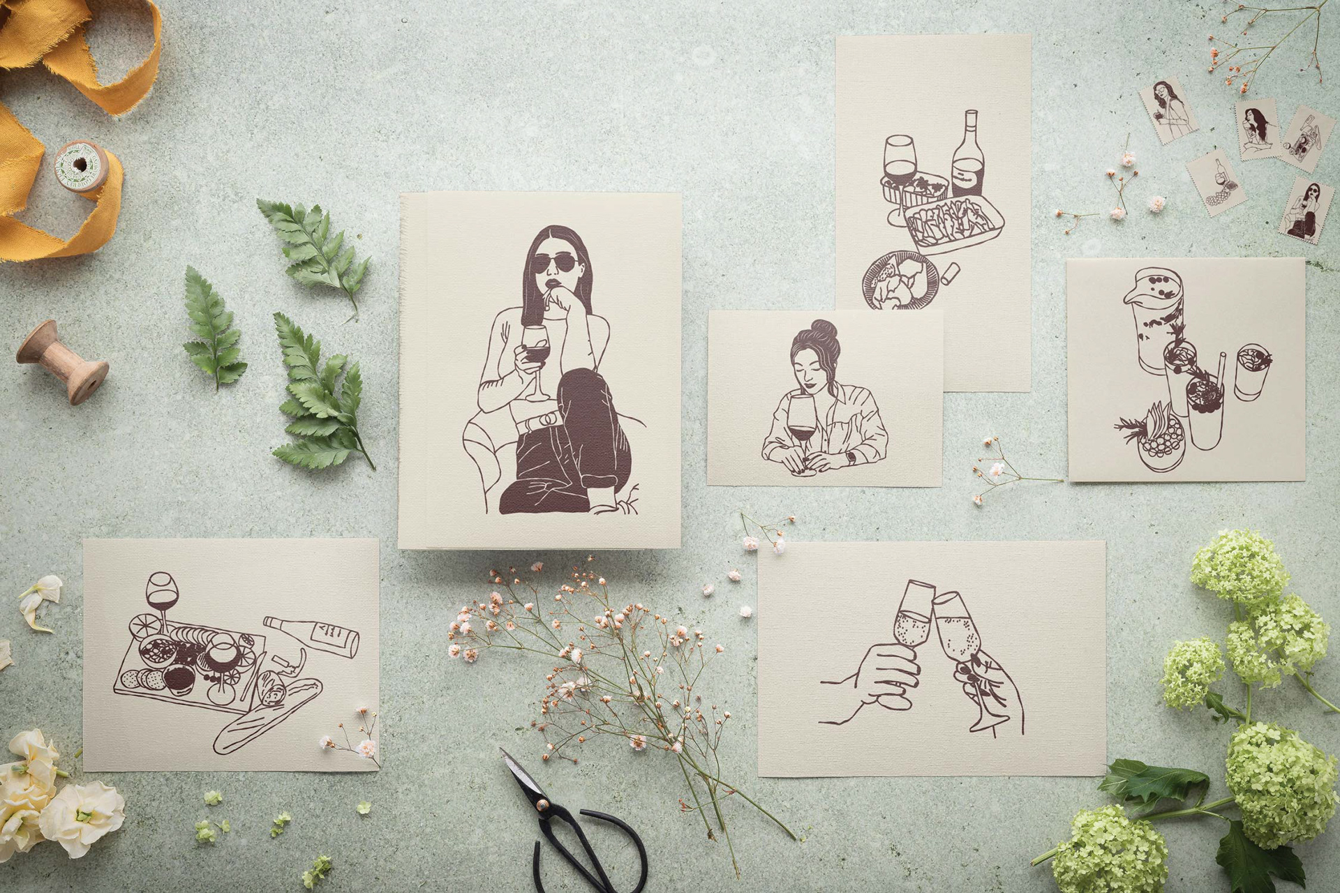
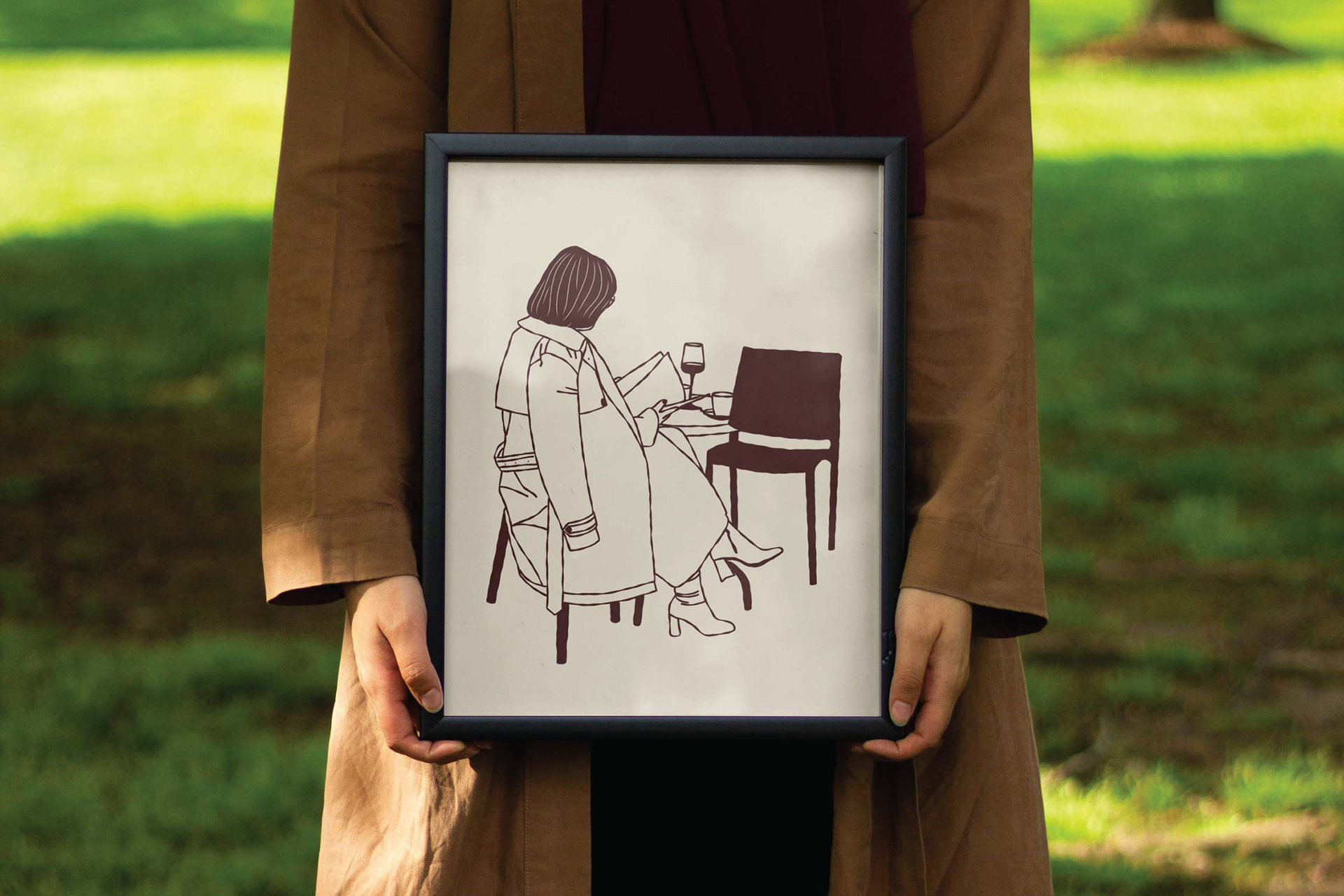
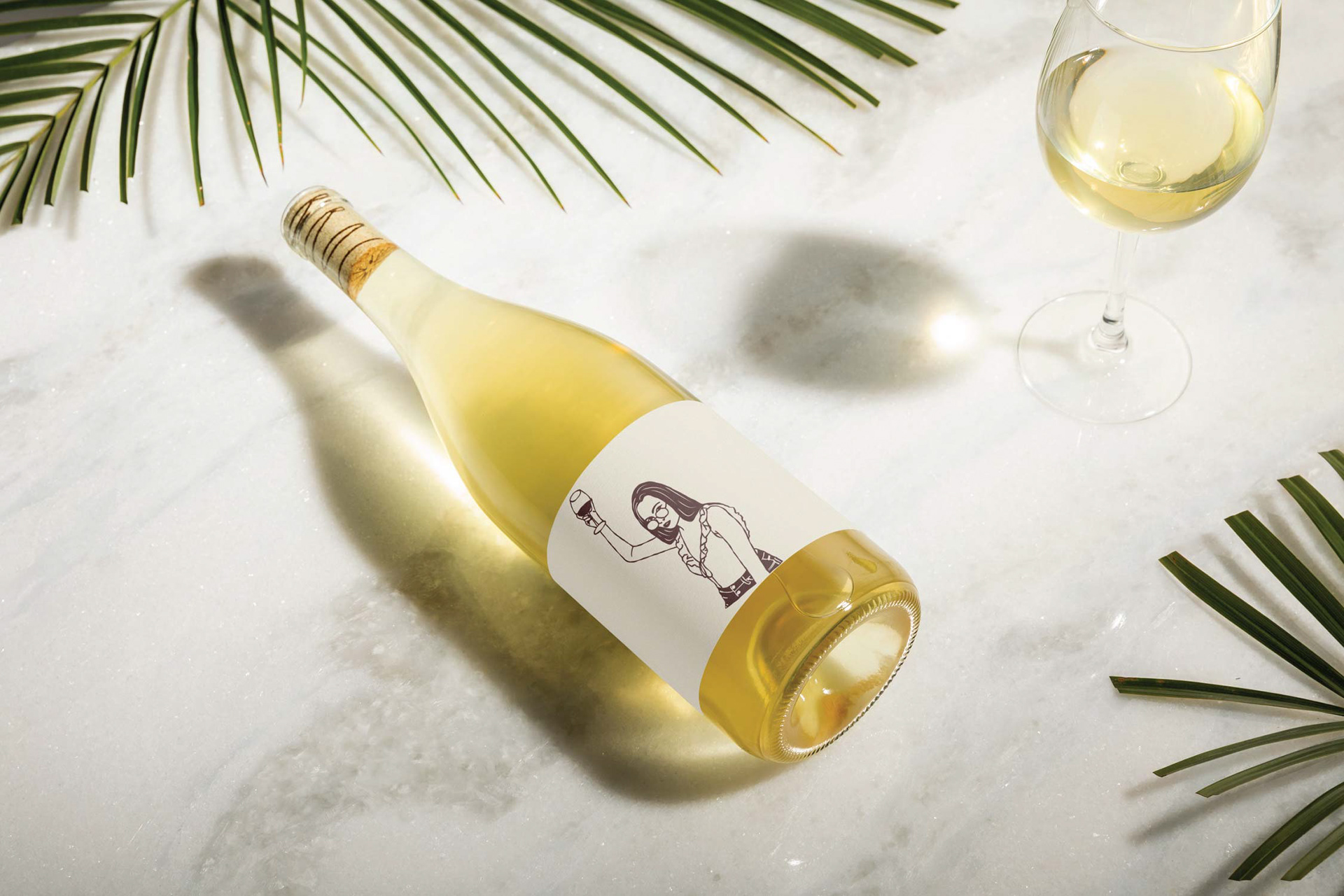
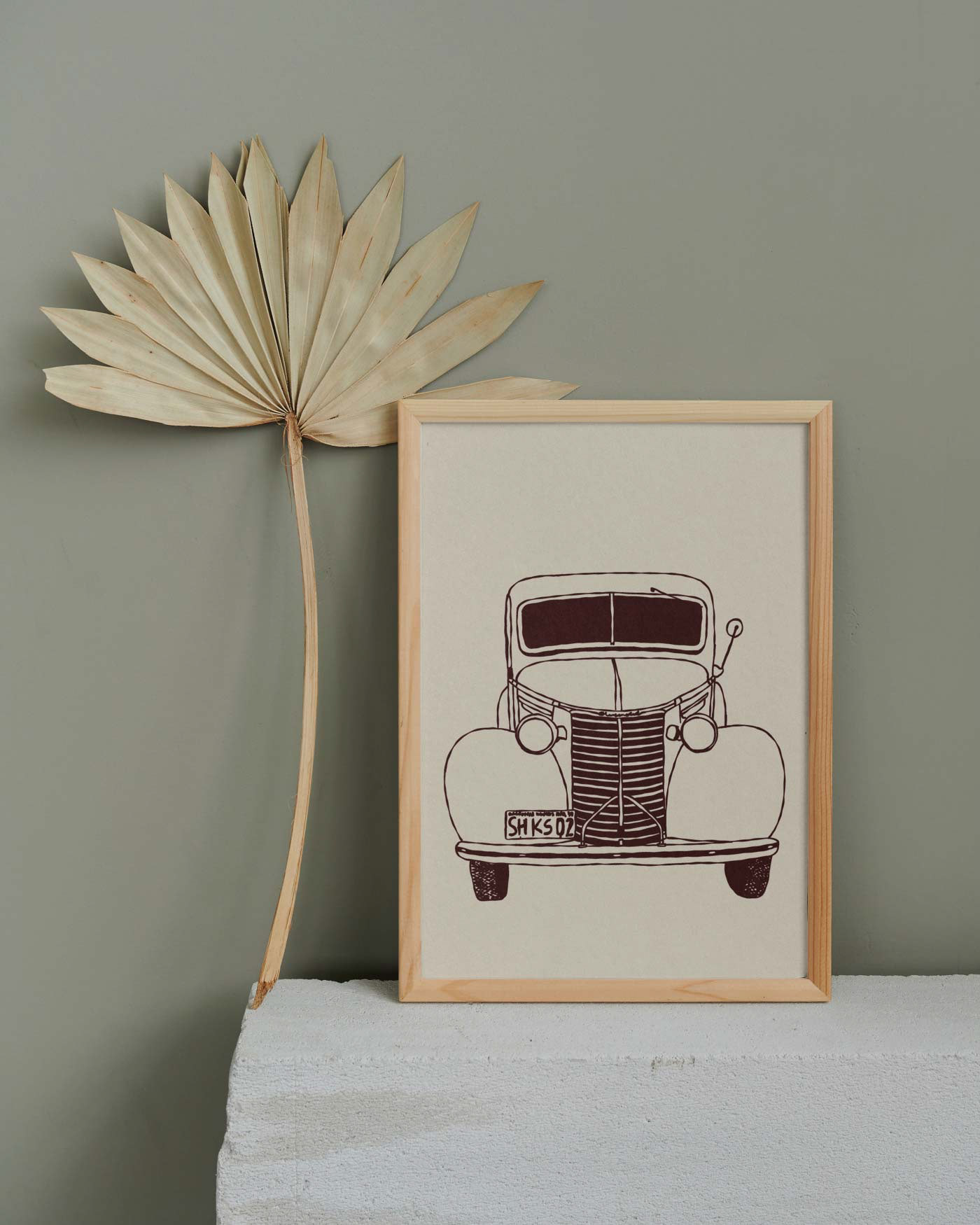
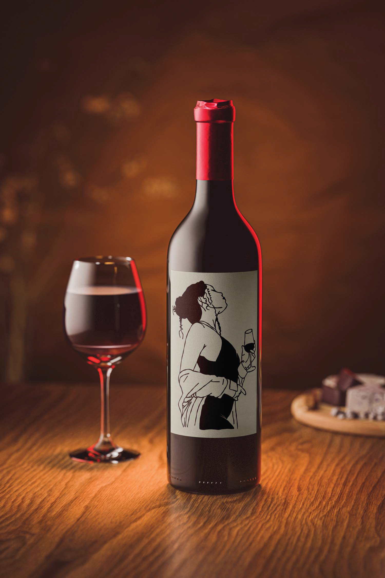
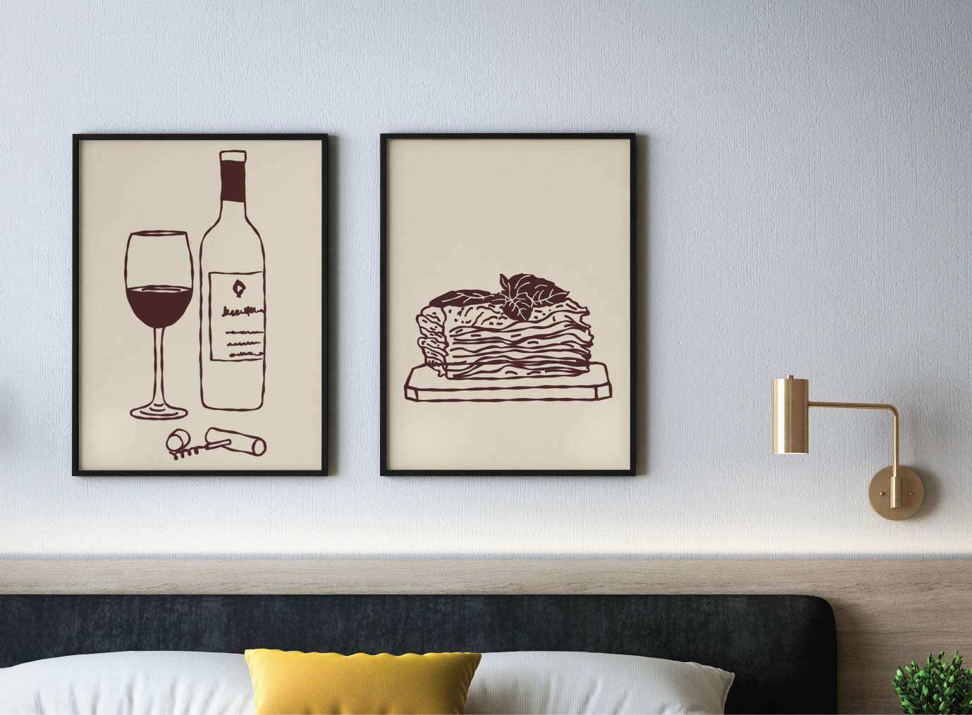
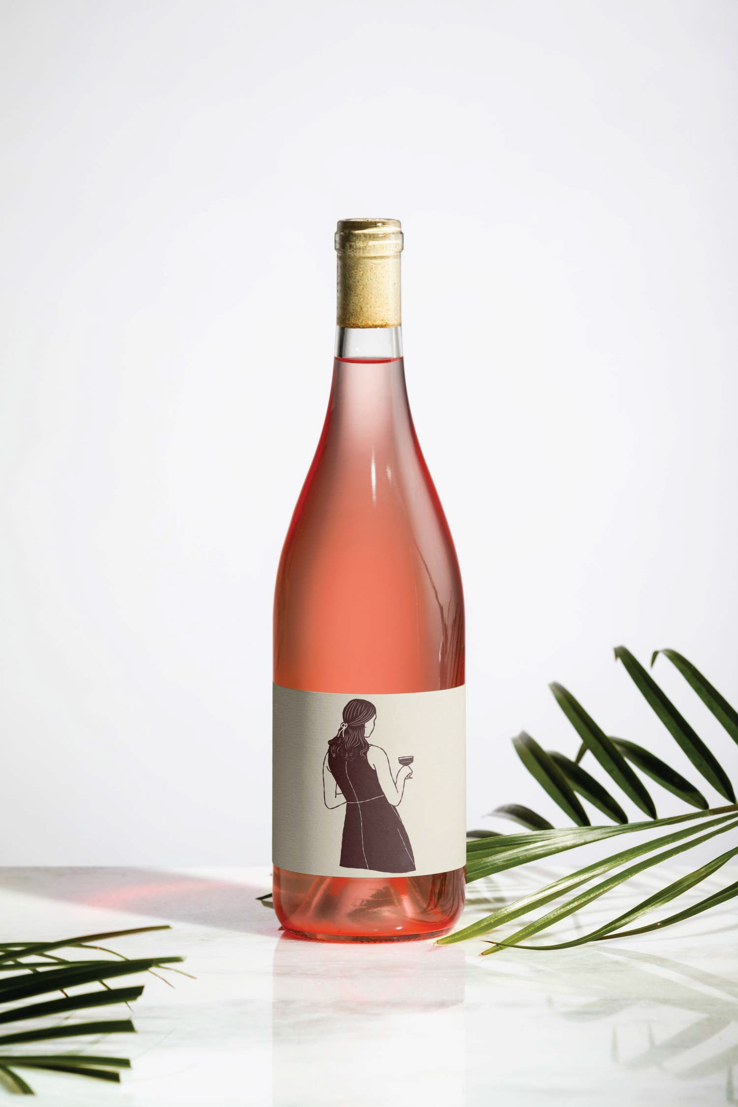
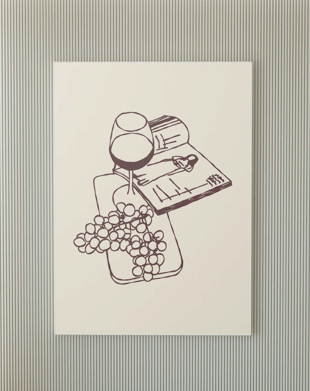
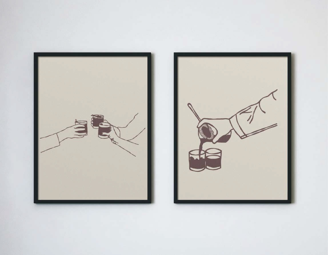
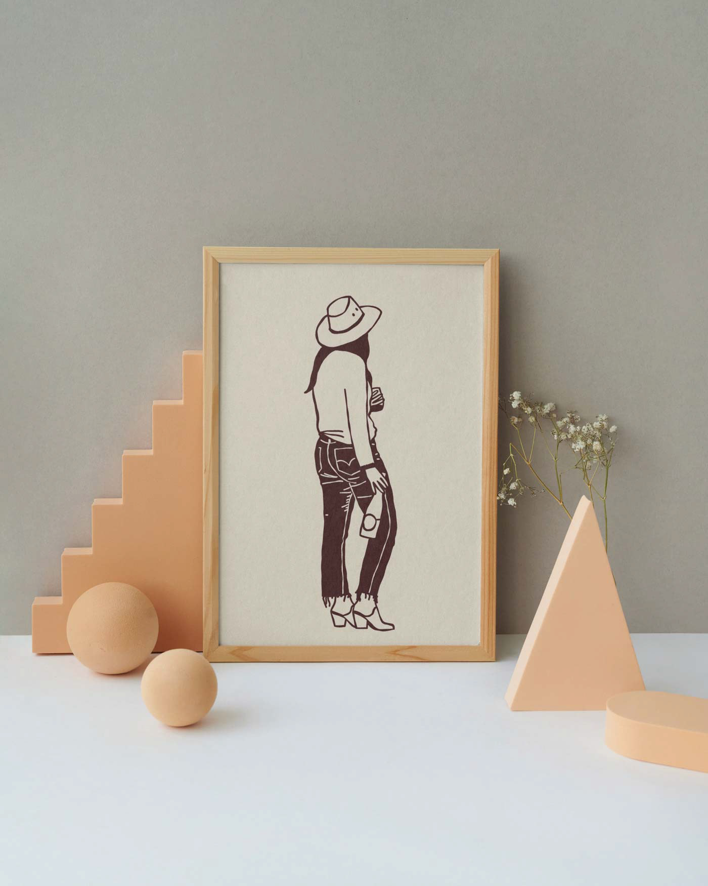
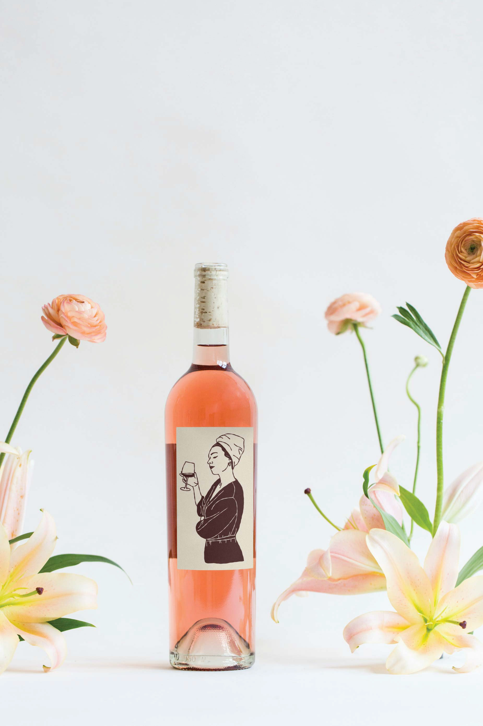
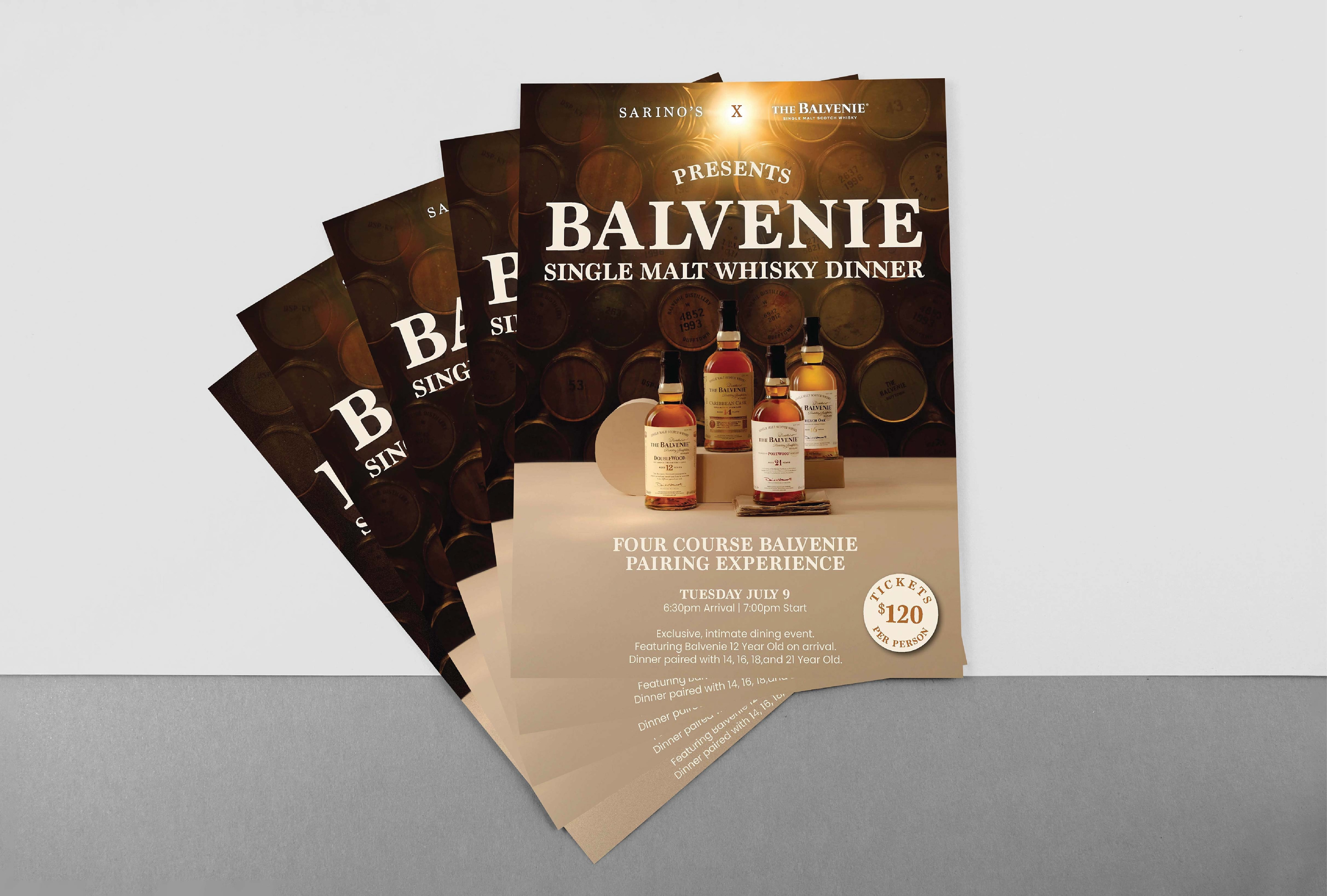
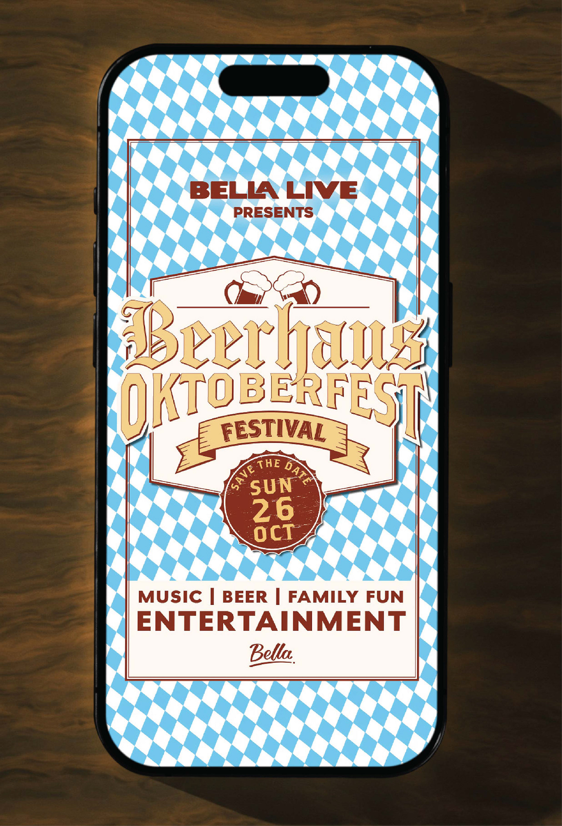
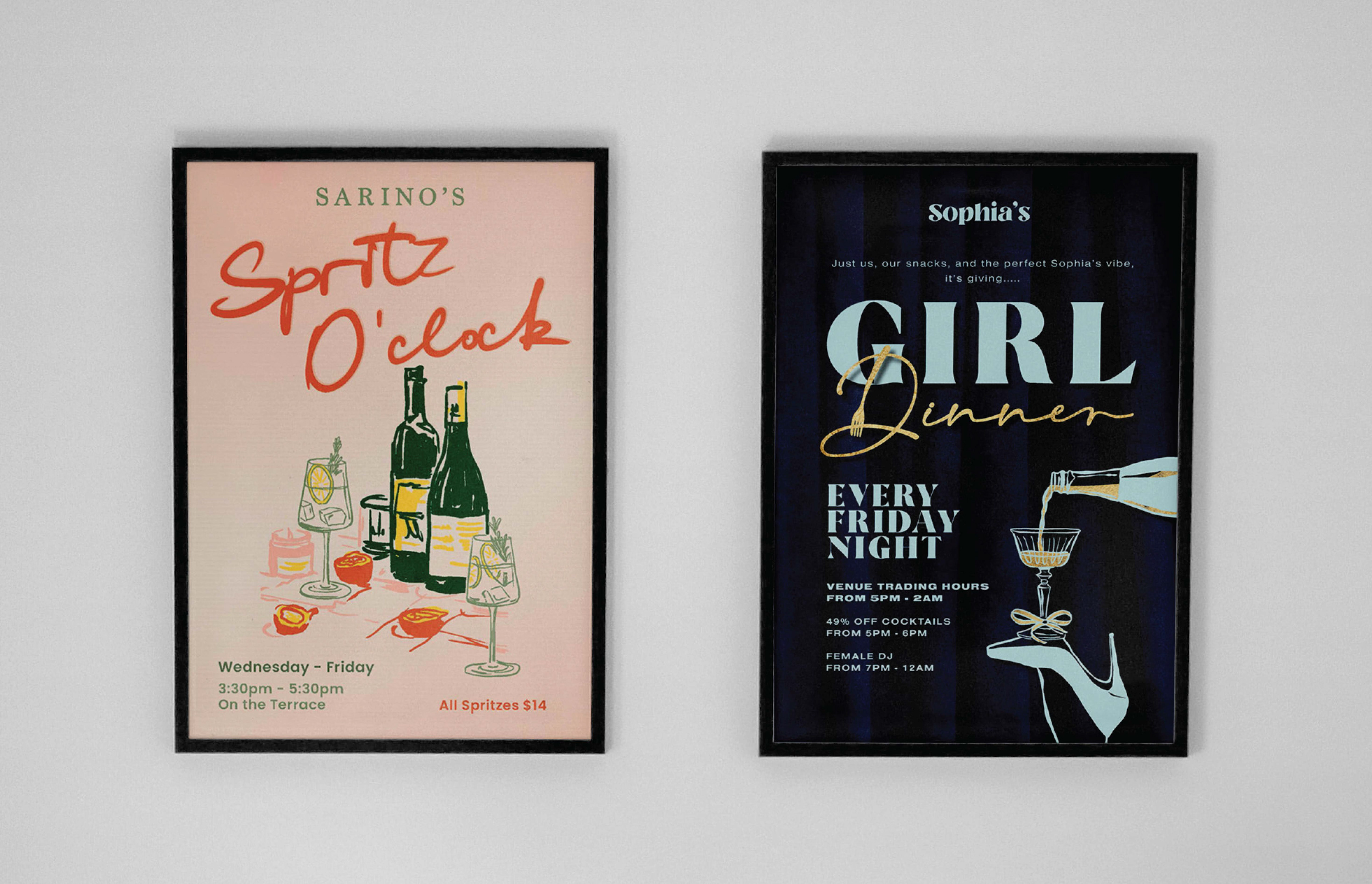
Sometimes Stock Imagery Just Doesn't Cut It.
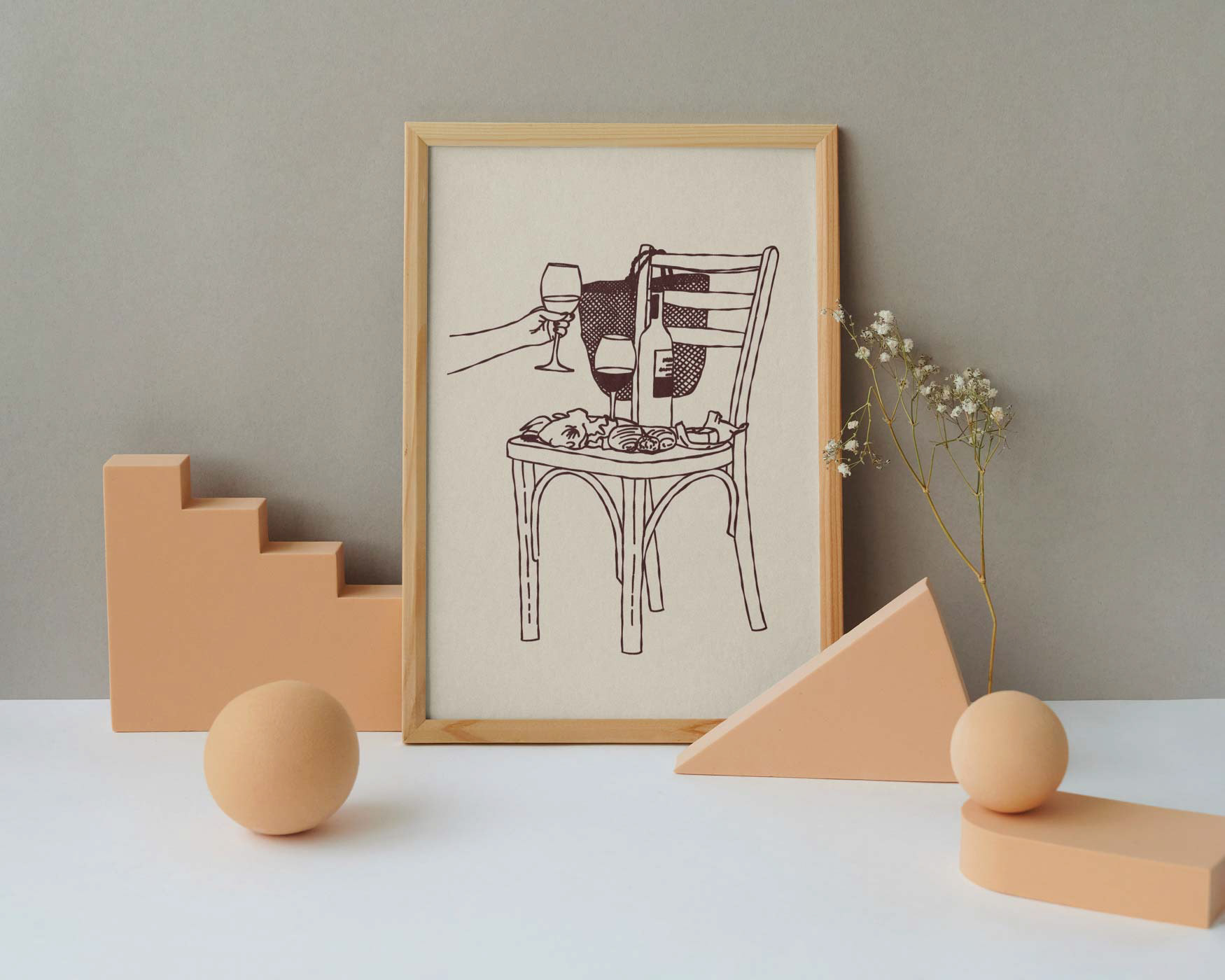
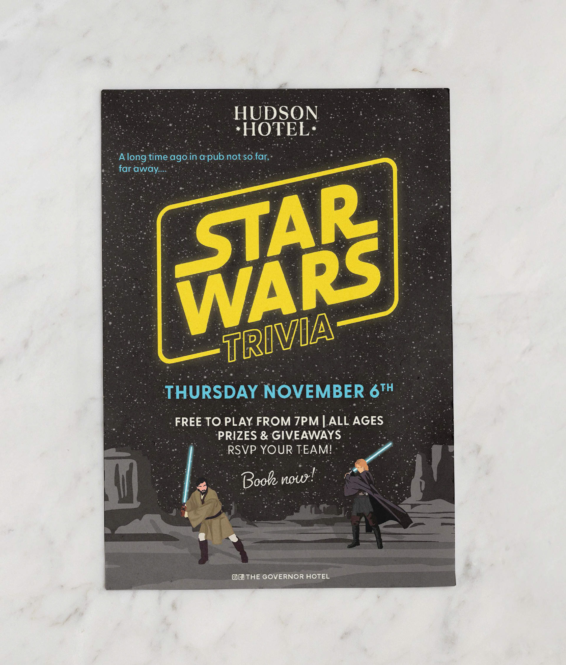
For a number of projects, I've created custom illustrations to give the final design something more personal and specific.
Whether it's a small graphic element or a collection of illustrations built specifically for a project, creating something from scratch can give a brand or artwork a much more distinctive feel.